Conversion Rate Optimization: The Complete Guide
Conversion rate optimization covers a lot of ground: a simple formula, funnel diagnostics, landing pages, forms, checkout, test design, CTAs, page-level signals, and the tools that surface all of it. This guide walks through all seventeen pieces in order, grouped below by what they're actually for.
1. What Is Conversion Rate Optimization? The Basics and What Actually Affects Your Numbers
Conversion rate optimization starts with a simple number: the percentage of visitors who do the thing you actually want them to do. The math behind that number is simple. What actually moves it is where most of the confusion lives.
a. The formula
Conversion rate = (Conversions ÷ Conversion opportunities) × 100
For example, if 1,000 visitors reach a signup page and 30 sign up, the visitor-based conversion rate is 3%.
That denominator isn't always "visitors," though. Depending on the analytics tool and what you're measuring, the denominator may be visitors, users, sessions, or another defined population. The formula above uses visitors because it's the easiest to picture, but check what your own tool is actually counting before comparing rates across pages or tools.
The part that trips people up next isn't the math, it's the word "conversion" itself. A conversion isn't one fixed thing. It's whatever action actually matters for that page:
- A signup form
- A purchase
- A demo request
- A download
- A newsletter subscription
Two pages on the same site can have completely different definitions of "conversion," and comparing their rates directly doesn't tell you much unless you know what each one is actually counting.
b. Why one number hides more than it shows
A site-wide conversion rate is a single average sitting on top of a lot of very different traffic. It can look fine while individual pieces underneath it are badly broken, or look bad while most of the site is actually working.
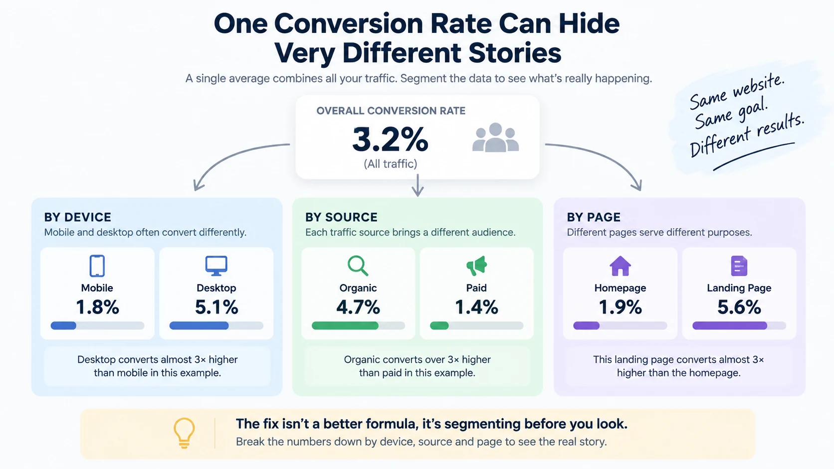
A few ways the average misleads:
By device. Mobile and desktop conversion rates are often meaningfully different, for the same page, same traffic source. A site-wide number blends both into something that describes neither well.
By source. A visitor arriving from a branded search already knows who you are. A visitor arriving from a broad ad campaign might not. Blending these together in one number hides which source is actually working.
By page. A landing page built for one specific offer will convert differently than a generic homepage. Averaging them together tells you nothing about which one needs attention.
The fix isn't a better formula, it's segmenting before you look. Break the number down by device, source, and page before deciding whether something's wrong.
c. What actually affects it
Conversion rate isn't one problem with one fix. It's the output of several different things working together, and a low number can come from any one of them, or several at once. Here's the map, briefly, each one covered in full depth elsewhere.
Traffic quality. If the people arriving at a page were never a match for what it offers, no amount of page polish will convert them. A visitor searching for a free tool won't convert on a page built for enterprise buyers, regardless of how clear the page is.
The offer. Price, positioning, and relevance to what the visitor actually needs. A page can be well-built and still underperform if the offer itself isn't compelling to the audience arriving on it.
The page. Clarity, trust, load speed, and structure. Does the page explain what it is within the first few seconds? Does it load fast enough that visitors don't leave before it finishes? Is there anything on the page that builds confidence, or does it ask for trust it hasn't earned yet?
The CTA. Whether there's one clear next step, whether it matches what the copy just promised, and whether it's visible without the visitor having to hunt for it.
Forms and checkout. Every extra field, unclear error message, or unexpected step at this stage is a place a visitor can drop off after they've already decided to convert, which is the most expensive kind of drop-off to lose.
Technical problems. A broken form, a slow page, a checkout step that fails silently on one browser. These don't show up as "low conversion" in an obvious way, they show up as inexplicably low numbers on a page that otherwise looks fine.
d. Where to go from here
This piece is the map, not the full diagnosis for any one of these. Each one gets its own full breakdown in the guides linked throughout this cluster: working the full funnel to find the actual drop-off point, telling a traffic problem apart from a page problem, the page-level signals that quietly cost conversions, CTA-specific issues, form and checkout friction, and how to test changes without wasting traffic.
The bottom line: conversion rate is a simple ratio measuring a complicated system. The number itself doesn't tell you what's wrong, it just tells you something's worth looking at. Segment it before trusting it, and work through traffic, offer, page, CTA, and technical causes one at a time rather than guessing at a single fix.
2. How to Find Conversion Bottlenecks on a Website
A conversion problem almost never lives everywhere at once. It usually lives at one specific step, where a predictable share of visitors quietly leave. Finding that step, instead of guessing at the whole page, is the actual job.
a. Lay out the funnel as real steps
Before diagnosing anything, write down the actual path a visitor takes for the conversion you care about. A typical funnel looks something like:
Landing page → CTA click → Signup form → Confirmation / checkout
Every business's exact steps differ, a SaaS signup funnel looks different from an ecommerce checkout funnel, but the principle is the same: break the journey into discrete steps you can measure separately, rather than treating "conversion rate" as one number covering the whole path.
b. Measure the drop-off at each step
For each step, you need two numbers: how many people reached it, and how many moved on to the next one. The ratio between them is that step's own conversion rate.
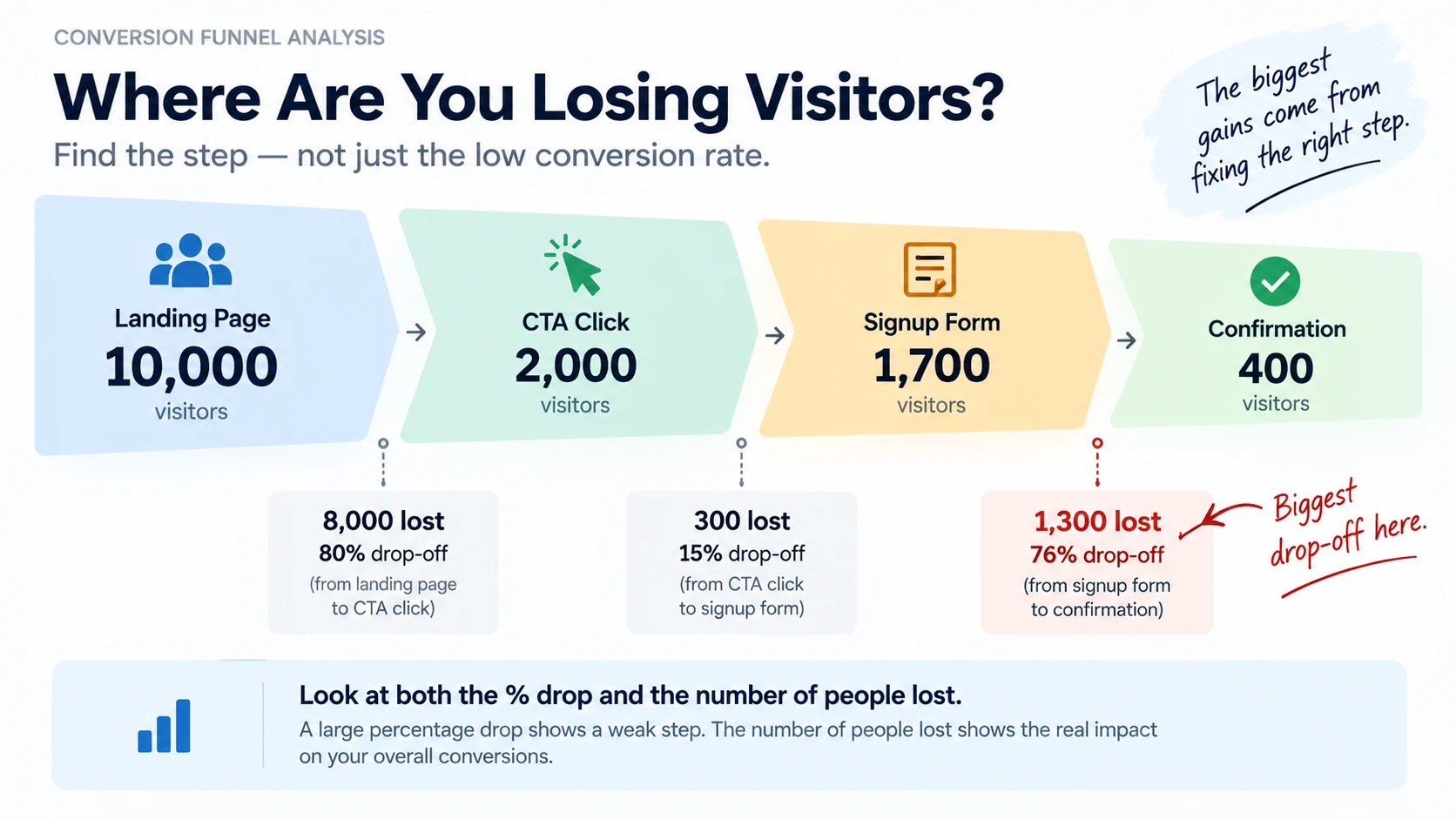
Lay them out together:
| Step | Reached | Moved on | Step conversion |
|---|---|---|---|
| Landing page | 10,000 | 2,000 | 20% |
| CTA click | 2,000 | 1,700 | 85% |
| Signup form | 1,700 | 400 | 24% |
| Confirmation | 400 | 400 | 100% |
Looking at this table, the landing page and the signup form are both worth attention, but they're not equally urgent. The signup form is losing 76% of the people who reach it, the sharpest drop in the whole funnel. That's the step to investigate first, not the CTA, which is actually performing fine relative to the traffic it gets.
c. Weigh both the percentage drop and the number of people lost
A step going from 100 visitors to 60 (a 40% drop) and a step going from 5,000 to 3,000 (also a 40% drop) aren't answering the same question. The second one loses far more actual people, even though the percentage looks the same. But the rate still matters: a large percentage drop identifies a weak step, and a large absolute loss tells you how many people that weakness affects. Look at both before deciding what to fix first.
d. Segment by device and source before drawing conclusions
The same funnel can behave very differently by device and traffic source. A form that works fine on desktop might be losing most of its mobile visitors to a layout issue. Traffic from a paid campaign might convert at a completely different rate than traffic from organic search, for reasons that have nothing to do with the page itself.
Before deciding a step is broken, split it by device and source. A step that looks fine in aggregate can be hiding a mobile-specific problem, or a source-specific mismatch, that the blended number never shows.
e. Distinguish a traffic problem from a conversion problem
Not every drop-off is the page's fault. If a step performs poorly across every device, source, and visitor segment, the page or flow becomes a stronger suspect, but check the offer and the audience too before deciding what to change. If the drop-off is concentrated in one specific source or segment instead, the more likely explanation is that the traffic itself wasn't a good match for what's being offered, not that the page is broken.
This distinction changes what you fix. A page problem gets fixed by changing the page. A traffic problem gets fixed by changing where the traffic comes from, or by building a different page for that specific audience.
f. Common mistakes
- Treating conversion rate as one number instead of a funnel of steps.
- Fixing the step with the scariest-looking percentage instead of the one losing the most actual people.
- Drawing conclusions from a blended number without checking device and source splits first.
- Assuming every drop-off is a page problem, without checking whether it's actually a traffic-quality problem.
- Changing several steps at once, so it's unclear afterward which change actually helped.
g. A practical example
Illustrative example: a SaaS company sees 12,000 monthly visitors and a 1.2% overall signup rate, and assumes the landing page needs a rewrite.
Breaking down the funnel first:
- Landing page → pricing page: 12,000 → 4,800 (40%)
- Pricing page → signup form: 4,800 → 600 (12.5%)
- Signup form → confirmed account: 600 → 144 (24%)
The landing page is actually performing reasonably, 40% of visitors move forward. The real bottleneck is the pricing page, losing nearly 88% of the people who reach it. Rewriting the landing page, as originally planned, would have left the actual problem untouched.
The bottom line: a funnel breakdown turns a vague "conversion rate is low" into a specific, checkable claim about one step. Find the step losing the most real visitors, segment it by device and source before assuming it's the page's fault, and fix that one step before moving to the next.
3. How to Tell if Your Conversion Problem Is Traffic Quality or Website UX
Two very different problems produce the same symptom: a low conversion rate. One is about who's arriving. The other is about what happens once they do. Fixing the wrong one wastes real effort, so telling them apart first matters.
a. Why this distinction gets skipped
It's tempting to jump straight to "the page needs work" because that's the part you can control directly. But a page can be genuinely well-built and still convert poorly, if the visitors arriving at it were never a good match for what it offers. Rewriting a page that was never the problem doesn't move the number, and it can take weeks to realize why.
b. Check whether the problem is consistent or source-specific
The fastest signal: does the low conversion rate show up across every traffic source, or is it concentrated in one or two?
Consistent across sources (organic, paid, direct, referral all convert similarly low): this points toward a UX or page problem, since a page issue affects every visitor regardless of where they came from.
Concentrated in specific sources: this points toward traffic quality. A source sending visitors who convert far worse than the rest usually means that source's audience doesn't match the offer, not that the page itself is broken.
c. Check engagement signals alongside conversion rate, not in place of it
Fast exits (low time on page, high bounce, few scrolls) can be a useful signal of a traffic or intent mismatch, but they don't prove one, a genuinely interested visitor can also leave quickly because they found what they needed right away. Longer engagement doesn't prove the page is working either, a poor-fit visitor can spend real time browsing without ever being a match for the offer.
Use engagement data as one input alongside the conversion funnel and traffic source, not as a standalone diagnosis. Fast, shallow exits concentrated in one specific source, combined with a source-specific conversion gap, is a stronger traffic-quality signal than engagement data on its own.
d. Check if the drop-off matches a real page issue
If UX is the actual cause, there's usually something concrete to find: a confusing above-the-fold message, a CTA that doesn't match what the page promised, a form with too much friction, a page that loads slowly. If none of these show up on inspection and the page reads clearly to a fresh pair of eyes, the more likely explanation shifts back toward traffic quality.
e. What to do with each answer
Traffic quality problem → the fix is upstream: adjust targeting, refine ad copy to set correct expectations, or build a dedicated page for that specific audience instead of sending them to a generic one.
UX problem → the fix is on the page itself: clarify the above-fold message, reduce form friction, fix load speed, strengthen the CTA.
Both → not uncommon. A mismatched audience and a genuinely weak page can compound each other. Fix the more clearly identifiable one first, then re-measure before assuming the other still needs work.
f. Common mistakes
- Assuming every low conversion rate is a page problem because that's the part that feels fixable.
- Not segmenting by traffic source before drawing a conclusion.
- Ignoring engagement signals (time on page, scroll depth) that would have told the story faster than conversion rate alone.
- Fixing the page first, then discovering the real issue was upstream, after the rewrite didn't move the number.
g. A practical example
Illustrative example: an ecommerce site's product page converts at 1.8% overall. Breaking it down by source:
- Organic search: 3.4%
- Email list: 4.1%
- A recent influencer campaign: 0.3%
The influencer campaign is dragging the average down, and its traffic bounces fast with almost no scroll depth. That's a traffic-quality signal, not a page problem, the audience from that campaign likely wasn't shopping for this specific product. The page itself, judged by its organic and email performance, is working fine.
The bottom line: before changing a page, check whether the problem is consistent across every source or concentrated in a few. A page that converts fine for most traffic but poorly for one source usually needs a traffic fix, not a redesign.
4. Why Your Landing Page Gets Visitors but No Signups
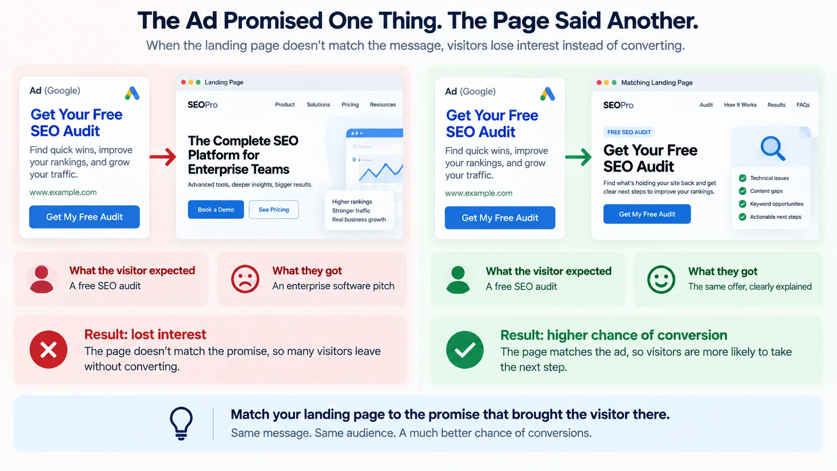
A landing page promoted with a "Get your free audit" ad gets solid traffic and almost no signups. The headline reads "The Complete SEO Platform for Enterprise Teams," with no mention of a free audit anywhere above the fold, and the signup form asks for company size, budget range, and phone number before it'll submit. Nothing about this page is broken in an obvious, technical sense, and yet almost nobody converts.
That's the pattern behind most landing pages that get traffic but no signups: not one dramatic flaw, but a small set of specific, checkable things worth working through in order.
a. Check intent match first
Before anything else: does the page match what the visitor expected when they clicked through? If an ad promises "free trial" and the landing page opens with a pricing table, that mismatch alone can account for most of the drop-off. Read the exact ad, email, or link text that sent the visitor here, then read the page as if you were that visitor. If the two don't line up, fix that mismatch before spending time on smaller page changes.
b. Above-the-fold clarity
The first screen has to make the page's purpose clear quickly. If visitors can't tell what the page offers or who it's for, some will leave before scrolling further. Check whether the headline alone, with no other context, actually explains the offer.
c. The CTA
Is there one clear next step, or several competing ones? Does the button's wording match what it actually does ("Start Free Trial" vs. a vague "Learn More")? Is it visible without scrolling, or buried below content the visitor may never reach?
d. Form friction
If signing up means filling out a form, every extra field is a place someone can decide it's not worth finishing. Check how many fields are actually required versus how many are just convenient to collect. Removing unnecessary fields can reduce friction, but don't assume every shorter form will convert better. Test whether each field is actually worth the extra effort it asks from the visitor.
e. Trust
Would a first-time visitor have any reason to believe this is legitimate? Signals like real customer names, specific outcomes, or recognizable logos help here. Vague claims with no specifics behind them don't build trust, they can actually undercut it.
f. Offer mismatch
Sometimes the page is clear, fast, and well-built, and the problem is simply that the offer itself doesn't fit the audience arriving. A generic newsletter signup won't convert visitors who came looking for a specific tool. This is the hardest one to fix with page changes alone, since the fix is often the offer, not the layout.
g. Common mistakes
- Assuming a low signup rate means the page needs a full redesign, before checking intent match first.
- Adding more form fields "just in case" without weighing the conversion cost.
- Filling the page with generic trust language instead of specific, checkable proof.
- Never actually reading the ad or link that sent the visitor here, and comparing it against what the page says.
h. Back to the example above
The intent mismatch (ad promised something specific and free, page opened with enterprise positioning) and the form friction (three fields that feel like a sales qualification, not a free audit signup) are both likely causes here, and both are fixable without touching the offer itself.
The bottom line: work through intent match, above-fold clarity, the CTA, form friction, trust, and offer fit in that order. The earlier ones in that list tend to explain the biggest drop-offs, so check them first before assuming the fix is somewhere deeper in the page.
5. How to Find Form Abandonment Problems
A form that starts strong and finishes weak is one of the more expensive conversion problems, because everyone who abandons it has already taken at least one step toward converting before they leave. Finding exactly where and why they leave is a specific, checkable process.
a. Field-level friction
Every field on a form is a small decision point. Some are quick (name, email), others take real thought (company size, budget, detailed address). The more fields that require thought rather than a quick answer, the more opportunities there are to abandon partway through.
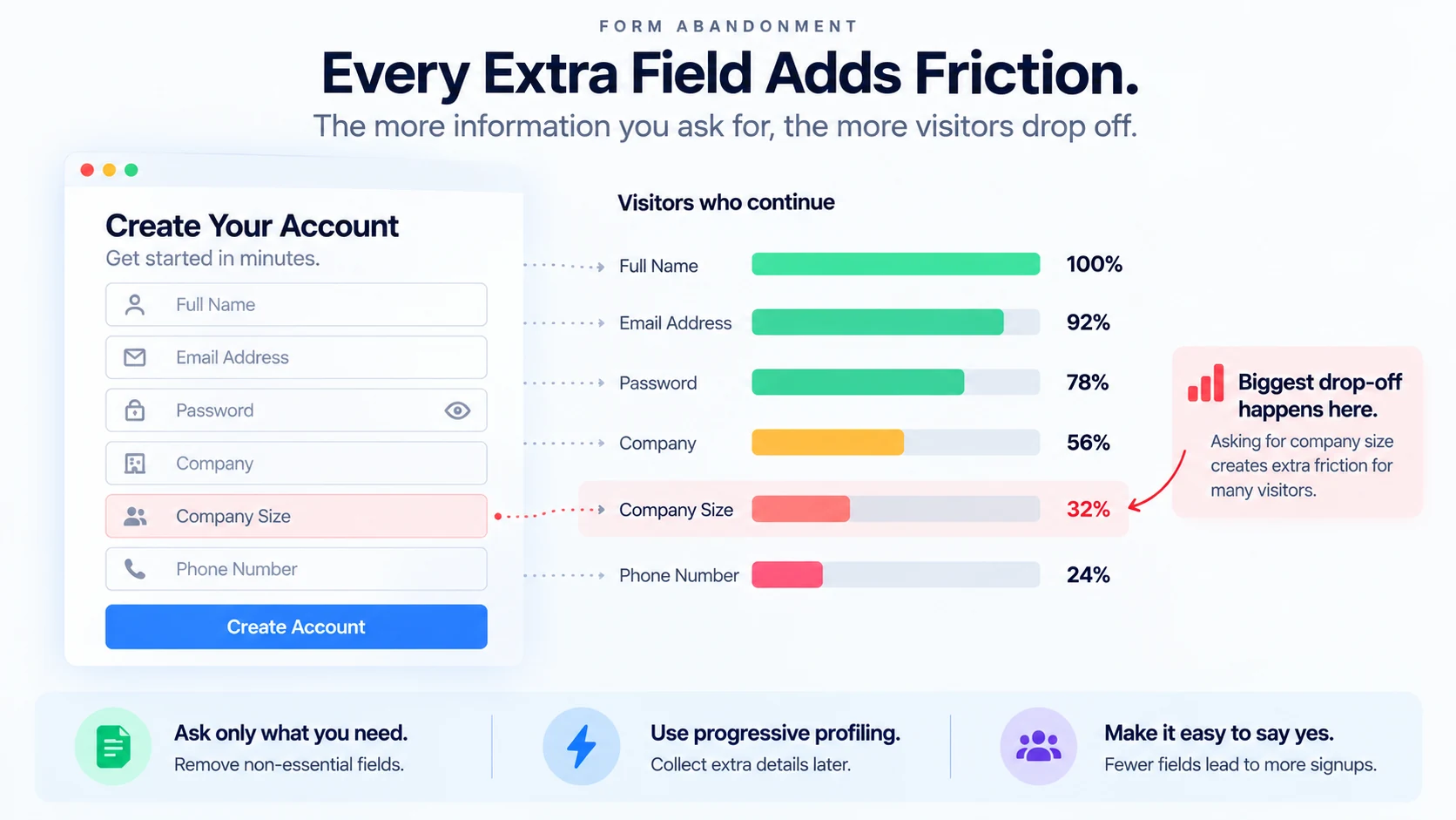
Go through the form field by field and ask honestly: is this field needed to complete the action, or is it there because it seemed useful to collect? Fields in the second category are the first candidates to cut or make optional.
b. Required vs. optional fields
Check how many fields are actually marked required. A long form with every field marked required can feel more demanding than a form where only essential fields are required. The same total field count, with the non-essential ones clearly marked optional, can feel considerably less demanding.
c. Error messages
A confusing or vague error message can stop a visitor cold, especially if it doesn't say which field is wrong or why. "Something went wrong" tells a visitor nothing actionable. A specific message ("Phone number must be 10 digits") lets them fix it and move on. Test your own form's error states directly, not just the happy path where everything is filled in correctly the first time.
d. Mobile experience
Forms that work fine on desktop can be genuinely difficult on a small screen: tiny tap targets, a keyboard that doesn't match the field type (a text keyboard for a phone number field), or a submit button that's off-screen until the visitor scrolls further than expected. Test the actual form on an actual phone, not just a resized browser window.
e. Multi-step forms
Breaking a long form into steps can help or hurt, depending on execution. It helps when each step feels short and progress is visible. It hurts when the total number of steps isn't clear upfront, so a visitor doesn't know if they're one step from done or five steps away, and abandons out of uncertainty.
f. Form analytics
If you have field-level form analytics available, they'll show you exactly which field most visitors abandon on, which turns a guess into a specific, fixable fact. Without that level of tracking, a simpler proxy works too: compare how many people start the form (first field interaction) against how many complete it, and if you can, check where in the field order most partial submissions stop.
g. Common mistakes
- Collecting fields "for later use" that aren't needed to complete the actual conversion.
- Testing only the happy path, never triggering an actual error message to see how it reads.
- Assuming a multi-step form is automatically better, without checking whether progress is clear.
- Not testing the real form on a real phone.
h. A practical example
A signup form has six fields: name, email, password, company name, company size, and phone number. Form analytics show a sharp drop after the company size field.
Company size isn't needed to create an account, it's likely there for internal segmentation, but it's the exact point where most visitors stop. Moving it to optional, or collecting it after signup instead of before, removes the friction point without losing the account creation itself.
The bottom line: work through field-level friction, what's actually required, real error message testing, the mobile experience, and step structure, in that order. If you have field-level analytics, use them to confirm exactly where people stop rather than guessing.
6. How to Find Checkout Conversion Problems
Checkout is the step where a visitor has shown strong buying intent and still might not finish. That makes checkout drop-off some of the most expensive lost conversion on a site, since most of the persuading work is already done by the time someone reaches it.
a. Break checkout into its real steps
A typical checkout flow: Cart → Checkout details → Payment → Confirmation. Some sites add an account-creation step, a shipping-method choice, or an order review step in between. Map the actual steps your checkout uses, then measure drop-off at each one separately, the same way you would for any other funnel.
b. Unexpected costs
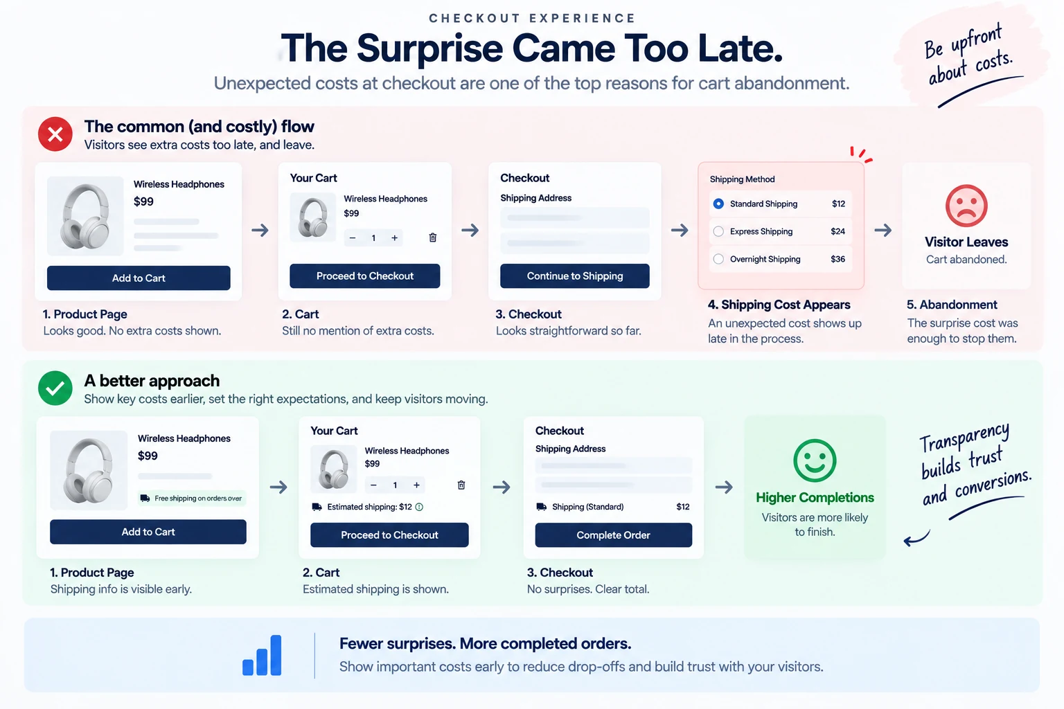
One of the most common, well-documented reasons for cart abandonment is a cost that appears late in checkout that wasn't visible earlier, shipping, taxes, or fees added only at the final step. If a large share of abandonment happens right after a cost summary appears, that's a strong signal worth checking directly by walking through your own checkout as a first-time buyer would.
c. Payment failures
Not every abandoned checkout is a choice to leave, some are failed payments that never got a second attempt. Check whether your payment processor logs failed transaction attempts separately from abandoned carts. A high failure rate on a specific payment method or card type points to a technical integration issue, not a persuasion problem.
d. Account requirements
Requiring an account creation before checkout can complete adds a real barrier for a visitor who just wants to buy once. If your checkout requires an account, check whether a guest checkout option would recover some of that drop-off, and if you already offer guest checkout, check that it's actually presented clearly rather than buried behind an account-first default.
e. Trust at the payment step
The payment step is where a visitor is asked to hand over financial information, and it's a natural point for hesitation if the page doesn't look secure or familiar. Recognizable payment logos, a visible security indicator, and a checkout page that looks consistent with the rest of the site all reduce last-moment hesitation here.
f. Mobile checkout problems
The same mobile issues that affect signup forms apply to checkout, often worse, since checkout usually has more fields (shipping address, payment details) than a typical signup form. Card number fields that don't trigger a numeric keyboard, tiny buttons, or a layout that requires excessive horizontal scrolling are common, specific things to check directly on a phone.
g. Common mistakes
- Only looking at overall cart abandonment rate instead of breaking checkout into its individual steps.
- Not separating failed payments from voluntary abandonment, they need completely different fixes.
- Assuming guest checkout is available and clearly presented without actually testing the flow as a new visitor.
- Never testing checkout on an actual mobile device.
h. A practical example
Illustrative example: an online store sees a 68% cart abandonment rate. Breaking the flow into steps: most visitors move smoothly from cart to checkout details, but a sharp drop happens right after the shipping cost is calculated and shown.
That's a fairly specific, fixable signal: the shipping cost, not visible earlier in the flow, is likely the actual cause. Showing an estimated shipping cost earlier, on the product or cart page, gives visitors that information before they've invested time in checkout, rather than as a late surprise.
The bottom line: break checkout into its real steps, check for unexpected late costs, separate technical payment failures from voluntary abandonment, and test both account requirements and the mobile experience directly. Checkout drop-off is usually a specific, findable friction point, not a vague trust problem.
7. How to Find the Best Pages to Run CRO Tests On
Not every page is worth testing. Running a test on the wrong page wastes time and produces a result too weak to trust either way. Picking the right page to test on is its own decision, separate from deciding what to change.
a. High traffic alone isn't enough
A page with a lot of visitors seems like an obvious testing candidate, but traffic alone doesn't make a page a good test target. A high-traffic page that's already performing well may still be worth testing, but the potential upside and testability should be clear before you commit traffic to it, a strong conversion rate on paper can still hide a poor-quality conversion or a segment worth improving.
b. Look at traffic times conversion opportunity
The pages most worth testing are the ones where real traffic meets real room for improvement: enough visitors to reach a trustworthy result, and a conversion rate low enough, relative to similar pages, that there's a meaningful gap to close.
A simple way to think about it: multiply a page's traffic by how far its conversion rate sits below a comparable, better-performing page. Pages high on both dimensions are the strongest candidates. A page with huge traffic but already the best conversion rate on the site has less upside. A page with real conversion problems but barely any traffic has upside but nothing to test with.
c. Make sure there's enough volume to actually learn from
A test needs enough visitors and enough conversions to tell a real result apart from random noise. A page getting a handful of visitors a day, even if its conversion rate looks bad, won't generate enough data to reach a trustworthy answer in a reasonable timeframe. Before committing to a test, estimate roughly how long it would take that page's traffic to produce enough conversions on each variant to compare meaningfully, if that timeline stretches into months, it's not a good candidate right now.
d. Don't waste tests on pages with almost no traffic
This is worth stating plainly because it's a common mistake: testing a low-traffic page usually just produces an inconclusive result after weeks of waiting, wasting the calendar time without a usable answer. Save testing effort for pages where a result is actually reachable in a reasonable window, and address low-traffic pages through other means (traffic growth, or applying best practices from other pages) instead.
e. Common mistakes
- Picking a test page because it's the homepage or feels important, rather than because it has real testing potential.
- Testing a page that's already performing well, where there's little room for a change to show up in the data.
- Starting a test on a low-traffic page without first estimating how much traffic and time it would realistically need. That estimate depends on the page's baseline conversion rate, the size of the effect you're hoping to detect, and how traffic gets split across variants, not just on how long the test has been running.
- Not checking, before starting, roughly how long the test will realistically need to run given the page's traffic.
f. A practical example (illustrative numbers)
A company is deciding between testing their homepage (200,000 monthly visitors, 4.2% conversion, already above their other pages' average) and their pricing page (18,000 monthly visitors, 1.1% conversion, well below comparable competitor benchmarks and their own product pages).
The pricing page is the stronger candidate here, not because of raw traffic, but because it combines real traffic volume with a meaningful, specific gap to close. The homepage, despite far more traffic, has less room to improve and any test result there would likely be a small, hard-to-detect change.
The bottom line: the best pages to test aren't simply the highest-traffic ones, they're the ones combining enough traffic to reach a trustworthy result with enough conversion opportunity to make the result worth having. Estimate both before committing testing time to a page.
8. A/B Testing: What Should You Test First?
The instinct to start with something small and safe, a button color, a headline word swap, usually produces a test too weak to teach you anything. What you test first should be picked deliberately, not by what feels easiest to change.
a. Start here: skip the cosmetic changes
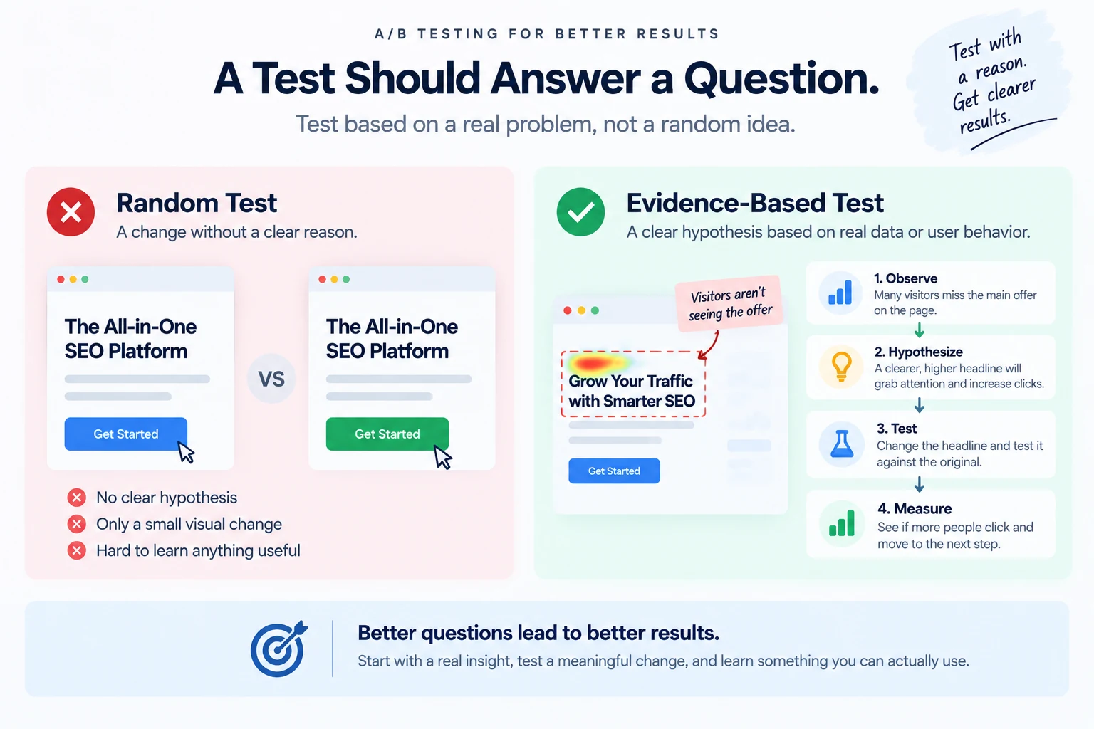
Button colors, minor wording tweaks, and small visual adjustments are popular first tests because they're quick to build. But they also tend to produce the smallest possible effect on conversion, which means they need enormous traffic to detect reliably, and even a "winning" result is often too small to matter in practice. Save these for later, once bigger opportunities have already been addressed.
b. Then check: is the hypothesis grounded and high-impact?
The tests worth running first are the ones testing a real hypothesis about why visitors aren't converting, not a cosmetic guess. If you've already done the diagnostic work (checking intent match, above-fold clarity, form friction, and so on), you should have a specific theory: "visitors don't understand the offer within the first screen" is a testable hypothesis with a clear fix to try. "Maybe a different button color would help" isn't grounded in anything you've actually observed.
c. Also check: your traffic and statistical limitations
Before choosing what to test, have a rough sense of how much traffic and how many conversions the page actually gets. A page with limited traffic needs to test changes big enough to produce a large, detectable effect, since it won't have the volume to reliably detect a small one. This is another reason to skip cosmetic tests first: they need the most traffic to prove anything, and a low-traffic page can't afford to spend testing time on them.
d. Finally: decide what you're actually testing
If your goal is to learn which specific change caused an effect, isolate one meaningful change at a time, a rewritten headline, a restructured form, a different CTA. That's the only way to carry a specific learning forward to the next page.
If you're testing a full redesign instead, that's a legitimate test too, but treat the result as a verdict on the overall experience rather than proof that any one element inside it caused the change. You'll learn less about which part mattered.
e. Common mistakes
- Starting with button colors or minor copy tweaks because they're quick to build, rather than because they address a real hypothesis.
- Testing without knowing whether the page has enough traffic to reach a reliable result in a reasonable time.
- Redesigning multiple elements at once and testing the whole bundle, then not knowing which change actually mattered.
- Picking a hypothesis with no grounding in what was actually observed on the page.
f. A practical example
A team's diagnostic work (working through the funnel and page signals) turned up two candidate issues on a landing page: the above-the-fold message doesn't clearly say what the product does, and the CTA button color is a low-contrast gray that's easy to miss visually.
The above-the-fold message is the stronger first test: it addresses a hypothesis grounded in actual review of the page, and a change there has a much larger plausible effect than a button color change. The button contrast issue is still worth fixing, since a genuinely hard-to-see CTA is a real problem, but it doesn't need a full A/B test to justify, it's a clear usability fix that can just be shipped.
The bottom line: test the changes with a real, observed hypothesis behind them and the largest plausible impact, before moving to smaller cosmetic ones. Know your traffic limits before committing to a test, and isolate one meaningful change per test so the result actually teaches you something.
9. How to Prioritize CRO Tests Without Guessing
Once there's more than one thing worth testing, and there usually is, the question becomes which one goes first. A simple, honest scoring framework beats picking by gut feeling or by whichever idea is loudest in the room.
a. The dimensions that actually matter
Impact. If this test wins, how much could it plausibly move the number? A change addressing a major drop-off point in the funnel has more potential impact than a change to a step that's already performing well.
Traffic. Does this page or step get enough visitors to reach a trustworthy result in a reasonable time? A high-impact idea on a low-traffic page still isn't ready to test yet.
Confidence. How grounded is this idea in something you actually observed, versus a guess? A hypothesis backed by funnel data, session behavior, or a clear usability issue is stronger than a hunch.
Effort. How much work does this test take to build and ship? A small change that's quick to implement can be worth prioritizing over a bigger one that would take weeks to build, especially if both have similar expected impact.
b. One simple prioritization formula you can use
Score each candidate test on impact, confidence, and effort (each on a simple scale, say 1 to 5), then combine them:
Priority score = (Impact × Confidence) ÷ Effort
This isn't an established CRO formula, it's just one straightforward way to make the comparison explicit instead of arguing from opinion. It rewards ideas that are both high-impact and well-grounded, while penalizing ideas that would take a lot of work relative to what they might return. Treat the score as a rough comparison tool, not precise math.
c. Opportunity size as a gut check
Alongside the score, sanity-check the raw opportunity: how many actual conversions could this page realistically gain if the test succeeds? A test that could plausibly add a handful of conversions a month matters less than one that could add hundreds, even if their scores come out similar on paper.
d. Revisit the list as data comes in
Priorities aren't fixed. Once a test finishes, whether it won, lost, or was inconclusive, that result should inform what gets tested next. A losing test on a hypothesis you were confident in is itself useful information, worth digging into before assuming the next idea on the list is automatically the right one.
e. Common mistakes
- Prioritizing by whoever's idea it was, or how recently it was suggested, instead of a consistent framework.
- Skipping the traffic check and prioritizing a high-impact idea that a low-traffic page can't actually test in reasonable time.
- Treating the priority score as precise math instead of a structured way to compare rough estimates.
- Never revisiting the list after a test finishes, so old assumptions don't get updated with new data.
f. A practical example
A team has three test candidates: rewriting the pricing page's headline (high traffic, high confidence from funnel data, moderate effort), changing the checkout button text (moderate traffic, low confidence, very low effort), and redesigning the entire homepage (high traffic, low confidence, very high effort).
Scoring roughly: the pricing headline rewrite scores highest, strong impact and confidence relative to its effort. The checkout button text change, despite being easy, scores lower since there's little grounded reason to expect a large effect. The full homepage redesign scores lowest, the effort is too high relative to how confident the team actually is that it'll help.
The bottom line: score candidate tests on impact, confidence, and effort rather than picking by instinct or by whoever proposed the idea. Check the raw opportunity size as a sanity check, and let each test's result update the list rather than treating priorities as fixed.
10. Why Your A/B Test Didn't Increase Conversions
A test that shows no improvement, or even a worse result, isn't automatically proof the idea was wrong. Several different things can cause a flat or negative result, and telling them apart matters before abandoning an otherwise reasonable hypothesis.
A flat or negative result can come from several different places. Here's how to work out which one you're actually looking at.
a. If the test wasn't grounded in an actual observed problem, investigate: a weak hypothesis
Reread the original reasoning: was this test addressing something specific you'd found in the funnel or page review, or was it closer to a guess? A flat result on a weak hypothesis is the expected outcome, not a mystery.
b. If the test ran on limited traffic, investigate: not enough data
If the test didn't run long enough, or the page doesn't get enough visitors, to reach a large enough sample, a "no difference" result might just mean there wasn't enough data to detect a real difference that does exist. Check whether the test actually reached a size where a meaningful effect would have been detectable, not just whether it ran for a certain number of days. How much traffic you need depends on the baseline conversion rate and the size of the change you're trying to detect, not on a fixed calendar window.
c. If the overall number looks flat but the audience was mixed, investigate: a segment effect
A test can show no effect if it ran across a mixed audience where the change actually helped one segment and hurt another, canceling out in the combined number. If results are available broken down by traffic source or device, check whether the flat overall result is hiding a real effect in one segment.
d. If the test changed more than one thing, investigate: which change actually mattered
A flat result doesn't tell you whether every change was neutral, or whether one change helped and another hurt, and they cancelled out. This is one more reason single-variable tests are easier to learn from, even when they lose.
e. If the test ran for a short window, investigate: an unrepresentative sample
Running a test for too short a time can catch a weekend-only sample, a period affected by a promotion, or simply not enough full business cycles to average out normal day-to-day variation. Check whether the test ran long enough to cover a realistic range of typical traffic.
f. If the result shifted partway through, investigate: normal statistical noise
Even a real effect can look inconsistent over a short test window. A result that looked promising in week one and flat by week three isn't necessarily a sign the effect faded, it might mean the early result was itself noisy and the later, larger sample is the more reliable one.
g. Common mistakes
- Concluding a hypothesis was wrong from a test that never reached enough traffic to detect a real effect either way.
- Not checking whether a flat overall result was hiding a real effect in one segment.
- Treating a multi-change test's flat result as proof none of the changes worked, when they may have cancelled out.
- Reacting to early results before the test has run long enough to average out normal variation.
h. A practical example
Illustrative example: a team tests a new, more specific headline against the original and sees no meaningful difference after two weeks. Before concluding the headline change didn't matter, they check the numbers: the page gets around 40 conversions a week total, split across two variants, well below what's needed to reliably detect anything but a very large effect.
The honest conclusion here isn't "the new headline doesn't help," it's "this test didn't have enough traffic to tell us either way." The hypothesis itself may still be worth testing on a higher-traffic page, or over a longer window.
The bottom line: a flat or negative test result has several possible causes beyond "the idea was wrong," insufficient traffic, a mixed audience, multiple simultaneous changes, a short test window, or normal statistical noise. Check these before writing off a hypothesis that may just need a better-run test.
11. Can Too Many CTAs Hurt Conversions?
It seems logical: more chances to click should mean more conversions. In practice, it can work the opposite way. A page with several competing calls to action can convert worse than the same page with just one, when those buttons end up competing for the same decision.
a. Too many competing CTAs can create friction
When several buttons have similar visual weight but lead to different actions, the intended next step becomes less clear. That extra decision-making can add friction to the page, even when every individual option is reasonable on its own.
b. What this looks like on a real page
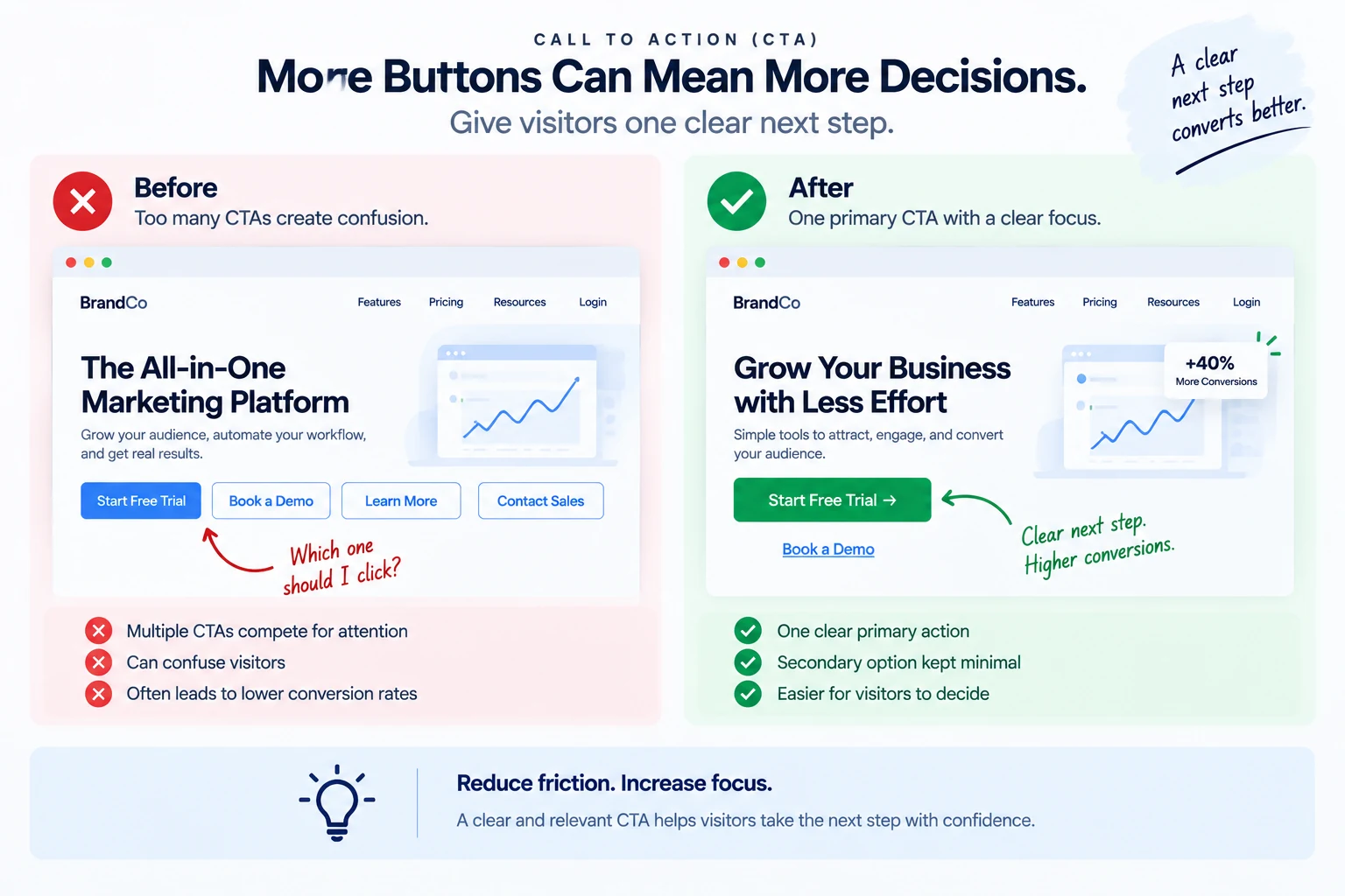
A common pattern: a hero section with "Start Free Trial" and "Book a Demo" side by side, both styled as primary buttons, followed further down the page by "See Pricing," "Download the Guide," and "Contact Sales," each also styled prominently. None of these are wrong actions to offer, the problem is that none of them is clearly presented as the primary one.
c. Give each section one clearly primary action
This doesn't mean a page can only have one button total. A useful starting point is to give each section of the page one clearly primary action, visually distinct from any secondary options nearby. Secondary actions (a text link, a smaller or outlined button) can coexist with a primary one without competing for the same visual attention.
d. How to check your own page
Look at each section of the page in isolation and ask: if a first-time visitor's eye lands here, is it obvious which single action is the intended next step? If two buttons in the same section are styled with equal visual weight, that's a signal worth fixing, even if both actions are individually reasonable.
e. This isn't about removing CTAs entirely
The fix usually isn't deleting every CTA but one, it's establishing a clear hierarchy: one primary action styled distinctly (solid color, larger, more visually prominent), with any other options styled as clearly secondary. A visitor should be able to tell at a glance which button the page wants them to click, even if other options exist nearby.
f. Common mistakes
- Styling multiple CTAs in the same section with equal visual weight, so none reads as primary.
- Adding a new CTA every time a new use case comes up, without revisiting whether older ones should become secondary.
- Assuming more total buttons on a page automatically means more conversion opportunities.
- Not testing the change, add a hierarchy to a cluttered section, then check whether conversions on the primary action actually improved.
g. A practical example
A product page has three equally-styled buttons stacked in the hero section: "Buy Now," "Add to Cart," and "Save for Later." Conversion on any single action is low, visitors spend time deciding between options that mostly overlap in function.
Consolidating to one primary action ("Add to Cart," styled prominently) with "Save for Later" reduced to a smaller secondary link, and removing "Buy Now" as a separate button entirely (since it duplicated what "Add to Cart" already led to), gives visitors one clear decision instead of three overlapping ones.
The bottom line: more buttons doesn't mean more conversions, it can mean more hesitation. Check whether each section of a page has one clearly primary action, and demote genuinely secondary options to a visually distinct, less prominent style rather than competing head-to-head.
12. How to Find the Right CTA for a Page
A CTA that technically works, the button is clickable, the link goes somewhere, can still be the wrong CTA for the page it's on. Finding the right one means checking it against what the page actually promised, not just whether it functions.
a. Start with what the page just told the visitor
Read the section of copy directly above the CTA, then read the CTA itself. Does the button feel like the natural next step from what was just said, or does it feel like a jump? A paragraph explaining pricing tiers followed by a CTA that says "Enroll Now" (with no clear indication what enrolling means or costs) creates a logical gap the visitor has to bridge themselves.
b. Match the CTA to the stage of intent
A visitor reading an educational blog post isn't usually ready for "Buy Now," that CTA assumes a level of decision-readiness the visitor probably hasn't reached yet. A softer next step, "Learn More" or "See How It Works," matches where they actually are. Conversely, a visitor already on a pricing page has likely moved past needing more general information, and a vague "Learn More" CTA undersells what they're actually ready to do.
c. Be specific about what happens next
Vague CTA text ("Submit," "Learn More," "Get Started") leaves the visitor to guess what actually happens after the click. Specific text ("Start My Free Trial," "See Pricing," "Download the Checklist") sets a clear, accurate expectation. Specific CTA text makes it clearer what happens after the click, which can reduce hesitation.
d. Check that the CTA doesn't overpromise
A CTA that says "Get Instant Access" should actually deliver instant access, not a signup form followed by an email verification step followed by a waiting period. A mismatch between what the button promises and what actually happens after the click erodes trust immediately, and can hurt not just that conversion but the visitor's willingness to trust the next CTA they see from you.
e. Test wording changes against a real hypothesis
If a CTA's wording is genuinely unclear or mismatched with the copy above it, that's worth testing directly, changing vague text to specific text, or adjusting the CTA to better match the visitor's likely intent at that point in the page. As with any test, this works best when it's addressing something specific you've actually noticed, not a random wording swap.
f. Common mistakes
- Using the same generic CTA text ("Learn More," "Submit") across every section of a page regardless of what each section actually offers.
- A CTA that assumes more decision-readiness than the visitor has reached at that point in the page.
- Button text that overpromises relative to what actually happens after the click.
- Never reading the copy directly above the CTA and asking whether the button is really the natural next step.
g. A practical example
A blog post about a specific problem ends with a CTA reading "Buy Now," linking directly to a checkout page. Given the article is educational, top-of-funnel content, most readers aren't at a buying decision yet, and the mismatch between the article's tone and the CTA's assumption is likely suppressing clicks.
Changing the CTA to something matching the reader's actual stage, "See How [Product] Solves This," leading to a page that explains the solution in more depth rather than straight to checkout, is worth testing as a next step that more closely matches where the reader actually is.
The bottom line: the right CTA matches the copy directly above it, the visitor's actual stage of intent, and delivers exactly what its wording promises. A technically functional CTA can still be the wrong one if it assumes more readiness than the visitor has, or if it's vague about what happens next.
13. Page-Level Signals That Quietly Kill Your Conversion Rate
Some conversion problems aren't about traffic or the offer, they're sitting directly on the page, in specific, checkable places most audits skip. The ten signals below are the framework RankAnalyze's Brand Deep Dive uses to score a page. They're not established industry terminology, think of them as a structured way to look at a page rather than a standard everyone in CRO already uses.
a. CTA Coherence
Does the button match what the copy right above it just said? A CTA reading "Book a Free Trial" after a paragraph about pricing tiers creates a logical gap the visitor has to bridge on their own. Every CTA should feel like the obvious next step from the text right above it, not a jump to something else.
b. CTA Cluster Audit
When several buttons have similar visual weight but lead to different actions, the intended next step becomes less clear. That extra decision-making can add friction to the page. A useful approach is to give each section one clearly primary action, with any other options visually secondary.
c. Above-Fold Value Prop
What a page is and who it's for should be clear quickly. If the first screen doesn't answer that, some visitors leave before scrolling to find out. It's often one of the first things worth checking on an underperforming page.
d. Value Latency
The headline makes a promise. If a visitor has to scroll well past halfway down the page before that promise is actually delivered on, in specifics, that's a gap worth closing. The core answer to "what does this actually do" should be clear quickly, not buried well below the fold.
e. Trust Signal Density
Visitors weigh credibility before converting, and what counts as credible proof depends on the audience: logos and case studies for a B2B buyer, reviews and specific outcomes for a consumer. Specific, named proof placed near the CTA can make that last step feel less risky.
f. Cognitive Load
Long, dense sentences and heavy use of passive voice can make a page harder to scan, especially when visitors are trying to understand an offer quickly, and a page that's harder to scan gives visitors more reason to leave before reaching the CTA.
g. Formatting Chaos Index
Random bolding, inconsistent font sizes, and ALL CAPS phrases scattered through a page can make it feel less polished and harder to scan, often without a visitor consciously noticing why a page feels "off."
h. Interactive Density
A page with zero interactive elements can feel like a brochure rather than something worth engaging with. Interactive elements help when they answer a question or remove uncertainty, a calculator, demo, or useful FAQ can give visitors information they need before taking the next step. Don't add interaction simply to keep people on the page; an element that distracts from the offer can hurt as much as it helps.
i. Intent Symmetry
A URL should give visitors a reasonable idea of where they're going. A slug like "/pricing" that leads to a page mostly about company benefits, with no actual pricing information, can create confusion and weaken the page's credibility.
j. Claim Substantiation
A precise-sounding number with no source behind it, "99.2% satisfaction," "22+ years of experience," reads as unverifiable, and unverifiable specifics can undercut trust more than a vaguer, honest claim would. Specific numbers can make a claim more credible when they're accurate and checkable. If there's no source behind the number, the precision can make the claim look less trustworthy rather than more.
RankAnalyze's Brand Deep Dive scores a page against these exact ten signals, CTA coherence, above-fold clarity, trust density, cognitive load, and the rest, so you get a specific, checkable list of what's actually costing conversions instead of a generic audit.
k. How to use this list
Go through a specific underperforming page against these ten, one at a time, the same way you'd work through any other diagnostic checklist. A page doesn't need all ten to have a conversion problem. The goal isn't a perfect score everywhere, it's finding the few signals that are actually relevant to this specific page.
The bottom line: page-level conversion problems are usually specific and checkable, not vague. These ten signals, CTA coherence, CTA clustering, above-fold clarity, value latency, trust density, cognitive load, formatting consistency, interactivity, slug-to-content match, and claim substantiation, cover most of what quietly costs conversions on an otherwise reasonable page.
14. How to Use Google Analytics to Find Conversion Drop-Offs
Google Analytics already has most of the data needed to find where visitors are dropping off, most people just aren't looking at it in the right shape. Here's a practical path through it.
a. Set up the relevant events and key events first
Before anything else, make sure the action you care about, a signup, a purchase, a form submission, is being tracked as an event, and marked as a key event when appropriate. GA4's terminology runs event → key event → conversion: any collected event can be marked a key event, and a key event becomes a conversion specifically when it's used to measure and optimize Google Ads campaigns. Check which label actually applies to what you're tracking rather than assuming pageviews alone tell the story. Without this, none of the funnel analysis below has anything real to measure against.
b. Build a funnel exploration
In GA4's Explore section, a funnel exploration lets you define a sequence of steps (landing page view → CTA click → form start → conversion) and see the drop-off percentage between each one, the same funnel-breakdown approach covered in the bottleneck-finding guide, but built directly from your real tracked events instead of estimated numbers.
c. Segment the funnel by device and traffic source
Once the funnel is built, break it down by device category and traffic source (both available as dimensions in GA4's exploration reports). A step that looks fine in the blended funnel can be hiding a mobile-specific or source-specific problem that only shows up once segmented.
d. Check entrances and exits for pages outside a funnel
For pages not part of a defined funnel, use page-level entrances and exits, or a path exploration, to see where sessions end. GA4 defines an exit as the last event in a session happening on a given page, and this data lives in Explore rather than one fixed standard report. A page with an unusually high share of session-ending exits, when it should be leading somewhere (a step midway through a signup flow, for instance), is worth investigating directly.
e. Use comparisons, not just totals
GA4 lets you set up comparisons directly in a report, comparing this month against last month, or one traffic source against another, side by side. This surfaces changes and differences much faster than switching date ranges back and forth manually.
f. Common mistakes
- Analyzing conversion problems from pageview data alone, without a properly configured conversion event.
- Looking at a funnel's blended numbers without checking device and source splits.
- Treating a high exit rate on every page as a problem, some pages (a confirmation page, for instance) are supposed to be the last one visitors see.
- Not using GA4's built-in comparison feature, and instead manually toggling date ranges to spot differences.
g. A practical example
Illustrative example: a funnel exploration for a signup flow shows a sharp drop between "form start" and "form submit." Segmenting by device shows the drop is far worse on mobile (78% abandon) than desktop (31%), a difference the blended number entirely hid.
That specific, segmented finding points directly at a mobile-specific form issue, worth investigating with the checks covered in the form abandonment guide, rather than a general "improve the signup form" task with no clear direction.
The bottom line: GA4's funnel explorations and segment comparisons can find exactly where and for whom visitors are dropping off, but only once conversion events are properly configured and the data is broken down by device and source rather than viewed as one blended total.
15. How to Use Heatmaps for CRO Without Overreading Them
A heatmap shows where visitors clicked, moved, or scrolled. It's genuinely useful, and also easy to misread if you draw stronger conclusions from it than the data actually supports. A click map shows where clicks landed. A scroll map shows how far down the page visitors typically reach. A move map (tracking mouse movement, sometimes used as a rough proxy for attention) shows where cursors lingered. Each of these tells you what visitors did, not why they did it, that second part still requires interpretation.
a. What a heatmap can tell you
Scroll maps are useful for checking value latency. If a scroll map shows most visitors never reach past 40% of the page, and something important, a key benefit, a trust signal, the CTA, sits at 60%, that's a direct, checkable finding: important content is below where most visitors actually scroll. This is one of the more reliable uses of a heatmap, since scroll depth is a fairly direct measurement.
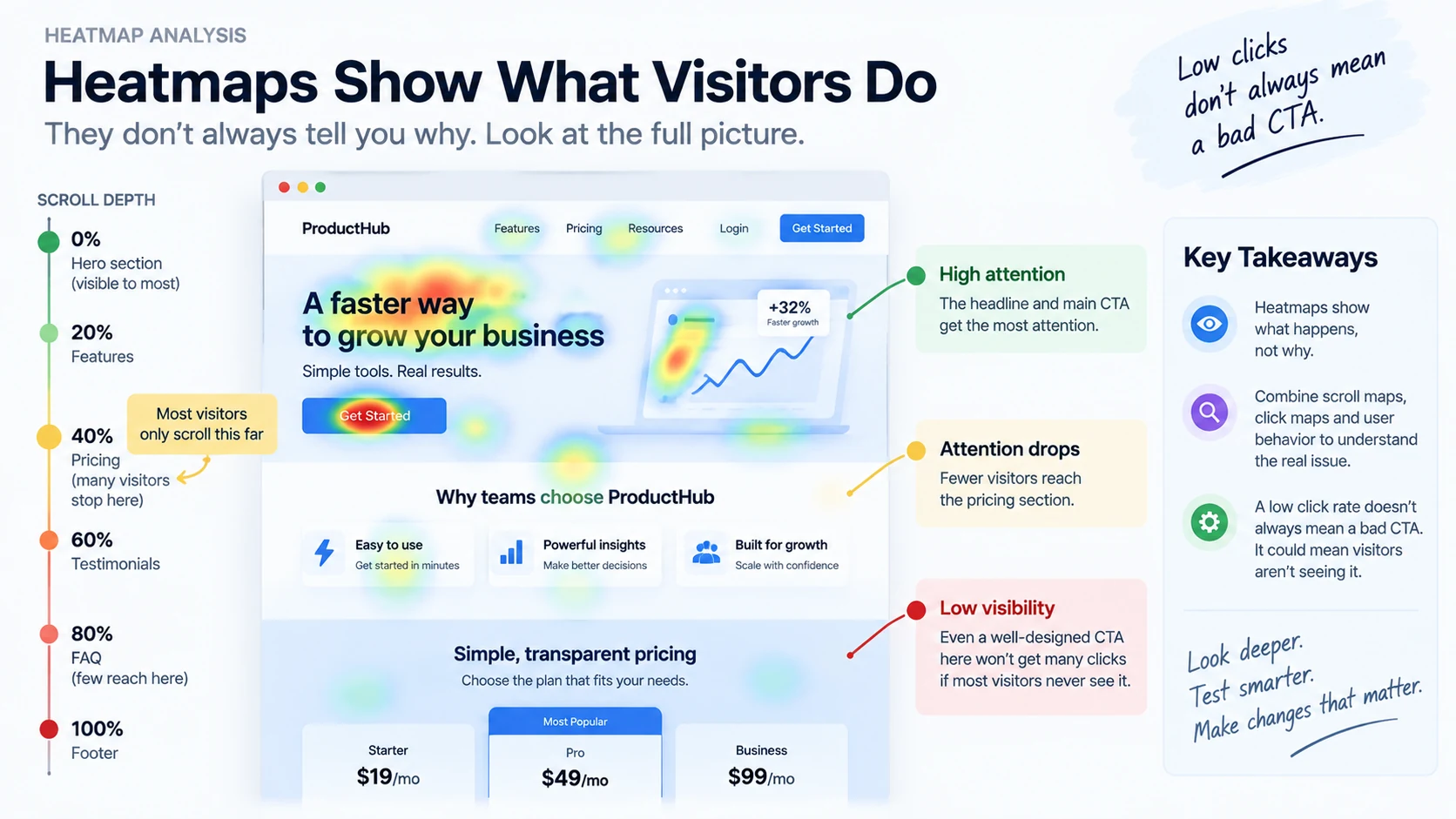
Click maps are useful for finding false affordances. A click map showing clicks on an element that isn't actually clickable (a bolded phrase that looks like a link, an image that looks like a button) is a specific, useful finding: visitors expect that element to do something, and it doesn't. This kind of mismatch is worth fixing directly, either making the element functional or changing its styling so it doesn't look clickable.
b. What a heatmap can't tell you
It can't tell you why clicks didn't happen. It's tempting to look at a CTA with few clicks on a heatmap and conclude the button itself is the problem. But low clicks on a CTA could mean the button is fine and few visitors scrolled far enough to see it, which a click map alone won't tell you, that's what the scroll map is for. Cross-reference before concluding.
It can't guarantee the pattern is real. A heatmap aggregates many sessions into one visual, but it doesn't automatically tell you whether the pattern you're seeing is based on a handful of sessions or thousands. Check the underlying sample size before drawing a firm conclusion from a heatmap pattern that might just be noise from limited data.
c. Common mistakes
- Concluding a CTA is the problem based on low clicks, without checking whether visitors even scrolled far enough to see it.
- Treating mouse movement as a reliable proxy for what a visitor was actually reading or thinking about.
- Drawing conclusions from a heatmap without checking how many sessions it's actually based on.
- Using a heatmap as the only source of evidence for a hypothesis, instead of one input alongside funnel data and session recordings.
d. A practical example (illustrative numbers)
Illustrative example: a scroll map on a pricing page shows 70% of visitors never scroll past the plan comparison table, missing the FAQ section further down that addresses common objections (refund policy, contract terms).
Rather than assuming visitors don't care about those questions, the more useful read is that the FAQ section is simply below where most visitors reach. Moving the most common objections higher on the page, closer to where visitors actually are, is a more direct fix than assuming the content itself doesn't matter.
The bottom line: heatmaps are strongest for showing scroll depth and false-affordance clicks, both fairly direct measurements. They're weakest when used to guess at intent or motivation from indirect signals like mouse movement, or when the underlying sample size isn't checked before drawing a conclusion.
16. How to Use Session Recordings to Find UX Problems
A session recording shows exactly what one real visitor did, every click, scroll, and hesitation, in order. Watched well, it can surface a UX problem a heatmap's aggregate view would never show. Watched carelessly, it's just a lot of time spent on anecdotes.
a. Don't watch randomly
Watching recordings at random, hoping something interesting turns up, is a slow way to find anything useful. Start with a specific question instead: why is the checkout page losing so many visitors at the shipping step? Filter recordings to sessions that reached that specific step, then watch those.
b. Filter to the sessions that match your hypothesis
Most session recording tools let you filter by page visited, by whether a specific event fired, or by whether the session ended in a conversion or not. Watching sessions that reached a known drop-off point, and specifically didn't convert, is far more useful than watching a random sample of all traffic.
c. Look for rage clicks and dead clicks
A rage click, several rapid clicks on the same spot, usually means a visitor expected something to happen and it didn't, a broken button, an unresponsive element, a slow-loading action they clicked repeatedly. A dead click, clicking something that isn't interactive, points at the same false-affordance issue a heatmap can surface, but a recording shows you the exact moment and context.
d. Watch for hesitation patterns
Repeated scrolling back and forth over the same section, or a long pause right before a form field, can indicate a visitor is confused or reconsidering. This is more subjective than a rage click, so treat it as a signal worth investigating further, not a conclusion on its own.
e. Watch a reasonable sample, not just one
A single recording is an anecdote. Before treating a pattern as real, watch enough sessions to see whether the same friction shows up repeatedly, rather than relying on the first recording you happen to watch.
f. Common mistakes
- Watching recordings without a specific question in mind, and losing time to sessions that don't relate to any actual hypothesis.
- Treating one unusual session as proof of a widespread problem.
- Ignoring rage clicks and dead clicks, some of the clearest, least ambiguous signals a recording can show.
- Not filtering to sessions that actually reached the part of the funnel you're investigating.
g. A practical example
Investigating a drop-off at the payment step, a team filters recordings to sessions that reached checkout but didn't complete payment. Illustrative example: across 12 recordings, several show the same pattern: a rage click on the "Apply Coupon" field after typing a code, followed by the visitor leaving shortly after.
That's a specific, repeated pattern, not one unusual session, pointing directly at a broken or unresponsive coupon field as a real cause of checkout abandonment, a finding a heatmap's aggregate view likely wouldn't have surfaced as clearly.
The bottom line: session recordings are most useful when filtered to a specific hypothesis and watched in a reasonable sample, not randomly or as a single anecdote. Rage clicks and dead clicks are the clearest, most actionable signals to look for.
17. How to Turn User Behavior Into CRO Test Ideas
Analytics, heatmaps, and session recordings each surface findings. None of them hand you a finished test idea, that translation step, from observed behavior to a specific, testable change, is its own skill worth doing deliberately.
a. Start from a specific, observed finding
A good test idea traces back to something you actually saw, a funnel step losing an unusual share of visitors, a scroll map showing key content below where visitors reach, a repeated rage click in session recordings. If a test idea can't be traced back to a specific piece of evidence, it's closer to a guess than a hypothesis, and belongs lower in the priority list covered in the test-prioritization guide.
b. Write the finding as a plain statement first
Before jumping to a proposed fix, write down exactly what was observed, in plain language: "78% of mobile visitors abandon the signup form between the email and password fields." This forces clarity about what you actually know, separate from what you're guessing might fix it.
c. Propose a specific change addressing that finding
Only after the finding is written plainly, propose the change: "test removing the password confirmation field on mobile, since it's the field directly after email where abandonment spikes." The connection between the observed problem and the proposed fix should be direct and explainable, not a leap.
d. Check that the fix is testable as one isolated change
Revisit the single-change principle from the testing guides: does this fix translate into one specific, isolated thing to test, or does it bundle several changes together? If the finding suggests multiple fixes, prioritize them separately rather than testing them all at once.
e. Cross-reference across sources before committing
A finding from one source (a heatmap showing low engagement in a section) is stronger when it's corroborated by another (session recordings showing visitors scrolling past that section without pausing, or funnel data showing a drop-off nearby). Findings that show up in multiple sources are more trustworthy than a single source's read alone.
f. Common mistakes
- Jumping straight to a proposed fix without first writing the observed finding down plainly.
- Proposing a fix that doesn't clearly trace back to the evidence that inspired it.
- Bundling multiple fixes into one test because they all came from the same research session.
- Trusting a single data source's finding without checking whether another source corroborates it.
g. A practical example
A scroll map shows most visitors on a product page never reach the customer reviews section, sitting near the bottom. Session recordings of the same page confirm this: visitors scroll through product details, then leave without reaching reviews. Funnel data shows this page has a lower conversion rate than similar product pages with reviews positioned higher.
Three sources corroborating the same finding turns this into a strong, specific test idea: move the reviews section (or a summary of it) higher on the page, closer to where visitors actually stop scrolling, and test that change in isolation against the current layout.
The bottom line: a real test idea starts with a specific, plainly stated finding, not a hunch. The strongest ideas are corroborated across more than one data source, and translate into one isolated, testable change rather than a bundle of fixes proposed all at once.
Frequently Asked Questions
What is conversion rate optimization?
Conversion rate optimization (CRO) is the practice of improving the share of visitors who complete a specific action on a page, a signup, a purchase, a form submission, without necessarily bringing in more traffic. It starts with measuring that action accurately and ends with testing specific changes to improve it.
How is conversion rate calculated?
Conversion rate = conversions ÷ conversion opportunities × 100. The denominator isn't always “visitors”, depending on the analytics tool, it can be visitors, users, or sessions, so check what your own tool is actually counting before comparing rates.
How do I find where visitors are actually dropping off?
Lay out the real steps of your funnel (landing page, CTA click, signup form, confirmation, for example), measure how many visitors reach each step and how many move on, then compare the drop-off at each step rather than looking at one overall rate.
What should I A/B test first?
A change addressing a real, observed hypothesis, something found in funnel data or page review, rather than a cosmetic guess like a button color. Cosmetic changes tend to produce the smallest effects, which need the most traffic to detect reliably.
How do I prioritize which CRO test to run first?
Score each candidate on impact, confidence, and effort. Priority score = (Impact × Confidence) ÷ Effort is one simple way to make the comparison explicit instead of arguing from opinion, though it's not a precise or established formula.
What can a heatmap actually tell me, and what can't it?
Scroll maps are reliable for checking whether important content sits below where most visitors actually scroll. Click maps are useful for spotting elements visitors expect to be clickable that aren't. Neither one tells you why a visitor did or didn't do something, that still needs interpretation alongside funnel data and session recordings.
See exactly how ChatGPT, Claude, Gemini, Perplexity and Copilot describe you today.