Google Trends: How to Read the Data and Turn It Into Content Ideas
Google Trends is free, and almost everyone who's done keyword research has opened it at some point. Far fewer people read it correctly. The number on the chart isn't search volume, "rising" doesn't mean "big," and a flat line for a low-volume term doesn't necessarily mean nobody searches for it. Misreading any of those leads to real mistakes: chasing a spike that's already over, or ignoring a keyword that's actually still growing.
This is how to use Google Trends: how to read the data correctly and turn it into decisions, using the same running-shoes example from our keyword research guide.
What Is Google Trends?
Google Trends is a free Google tool that shows how interest in a search changes over time, and how it compares with other searches, places and time periods. It doesn't show how many times something was searched (see Step 1 for what the number does mean).
For SEO, it answers questions a keyword tool doesn't answer well:
- Is interest in this topic growing, flat or falling right now?
- Does it peak at the same time every year?
- Which wording of a keyword do more people use?
- Which countries or regions care most about it?
How Does Google Trends Work?
Google Trends uses a sample of real Google searches. The searches are anonymized and grouped by topic, so no single person can be identified. For each point on a chart, Trends divides the searches for your term by all searches in that place and time, then scales the result from 0 to 100. Step 1 explains how to read that number.
You can open the data in three ways:
- Explore: research one or more terms over a time range you pick. Most of this guide uses Explore.
- Trending Now: what people are searching for right now (covered in Step 7).
- Explore with Gemini: the newer version of the Explore page (below).
The New Explore Page With Gemini
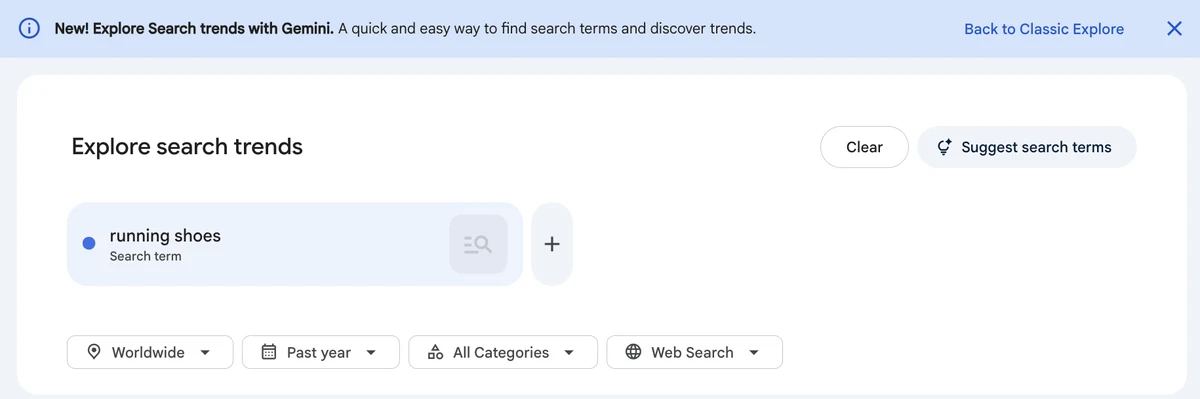
Google introduced a new Explore page with a Gemini side panel in January 2026. You describe what you're interested in, and it suggests up to eight search terms, then shows their trend lines and their top and rising queries. It's a quick way to find terms worth comparing in Step 2. Google notes that these features may show inaccurate information, so check each suggested term before you rely on it. If you prefer the old page, the "Back to Classic Explore" link at the top switches back.
How to Use Google Trends
The steps below are how to use Google Trends in practice -- reading the number correctly, comparing terms, checking seasonality and geography, then turning what you find into content decisions.
Step 1: Know What the Number Actually Means
The first thing to unlearn: the 0–100 line on a Trends chart (the "Interest over time" chart) is not search volume. Google's own documentation is explicit about this — data is normalized by dividing by the total searches in the time range and location you selected, then scaled from 0 to 100 based on a term's share of all searches, not given as a raw count.
A term sitting at 40 doesn't mean 40 of anything measurable. It means the term's relative interest is 40 on a scale where 100 represents its highest point of popularity in the time range and location you selected.
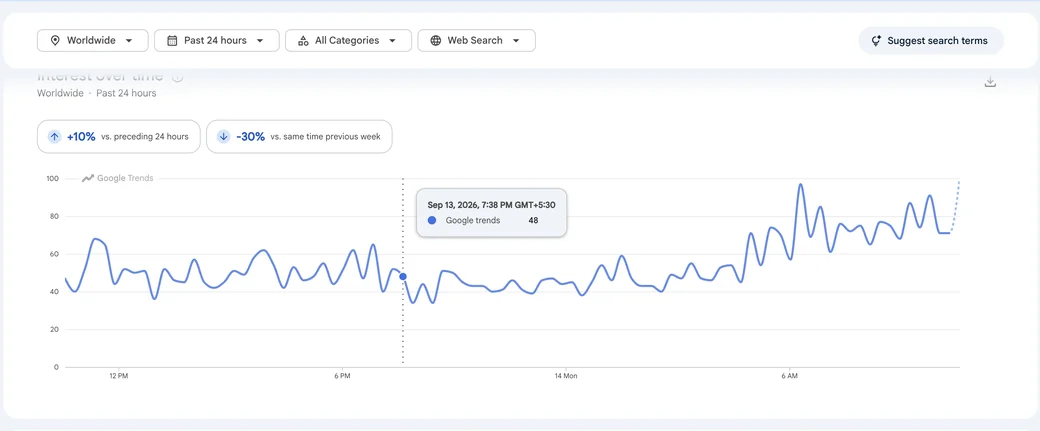
That has a direct consequence: you can't compare two separate single-term searches and conclude one has more volume than the other. A term scored 80 in one search and a different term scored 30 in another search aren't on the same scale, each chart is normalized to its own peak. To actually compare two terms, you have to search them together (Step 2).
The data itself comes from a sample, not every Google search, since Google processes billions of searches a day. Low-volume terms can show as a flat 0, not because nobody searches them, but because there isn't enough search activity for Trends to display meaningful data. That's common for long-tail keywords, so a flat line there isn't a reason to drop one on its own.
Good to know: Google filters some searches out of Trends, including searches made by its own products. That includes internal searches made by AI Mode and AI Overviews (see query fan-out). So Trends reflects what people search, not the extra searches Google's AI features make for them.
Step 2: Compare Keywords Properly
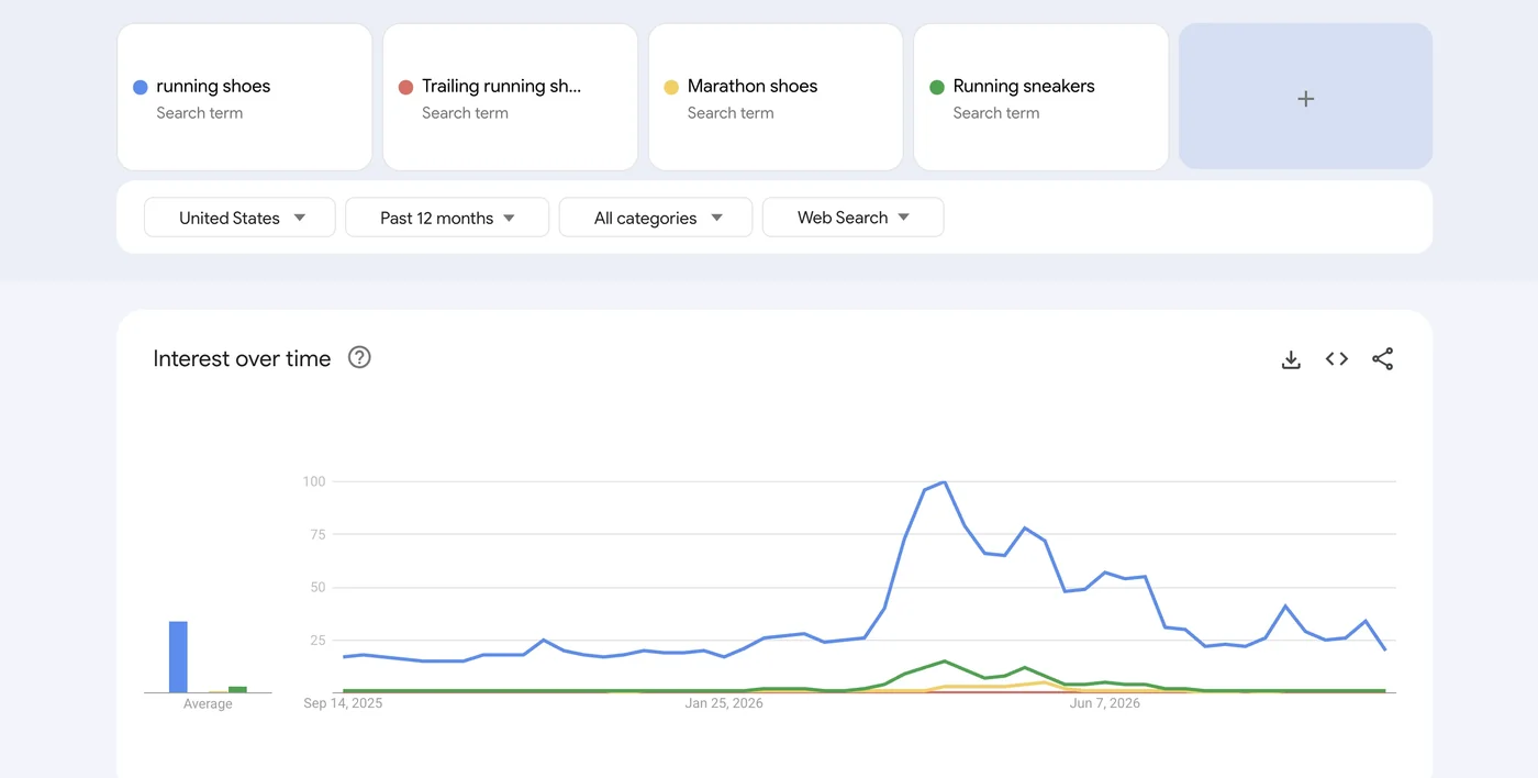
Type multiple terms into the same Trends search and they're plotted on a shared scale, with the highest point in the comparison set normalized to 100. That makes the comparison meaningful: the other terms are shown relative to that reference point.
You can compare far more than most people realize. The new Explore page supports up to 8 groups of terms at once, with up to 50 terms in each group. Classic Explore allows 5 groups of up to 25 terms each. Both are well beyond the "5 terms" limit that's still repeated in a lot of older SEO content. You can also download a chart as a CSV file if you want to work with the data in a spreadsheet.
For "running shoes," you might compare it against "trail running shoes," "marathon shoes," and "running sneakers" to see which phrasing actually carries more relative interest in your target country, rather than guessing which one to lead with in a title.
The same comparison approach works for brand-level decisions. Search two competing brand terms — "Brooks" against "Hoka," for example — together instead of separately, before writing something like a "Brooks vs. Hoka" comparison page (see our keyword research guide). Trends won't tell you which brand converts better, but a side-by-side chart tells you which one currently carries more relative search interest in your target market, which is useful context before deciding which brand to lead with in the page's title.
Step 3: Understand Search Terms vs. Topics
Trends lets you search two different kinds of things, and they measure different questions.
A search term is the exact word or phrase someone typed, nothing more. Search it and you only get data for that literal wording. A topic is a group of related searches Google has mapped to the same real-world concept, using its Knowledge Graph, and it can include different spellings, phrasings, and even languages that all point to the same thing.
Google recommends choosing a topic when one is available and you want the broadest view of interest in a concept, since it gives a more complete picture of interest in the underlying subject rather than just one way of phrasing it. Search terms are still the better choice when you specifically care about the exact wording, comparing "running shoes" against "running sneakers" as distinct phrasings, for instance, or researching a specific product name or brand term Trends hasn't mapped to a broader topic.
If a term has multiple meanings, Trends also lets you filter results to a specific category to get data for the right one, for example separating "jaguar" the animal from "jaguar" the car brand instead of measuring a blend of both. That's the Category filter, next to the location and time filters. Use it whenever a word has more than one meaning, so unrelated searches don't get mixed into the same trend.
Step 4: Read Rising and Breakout Queries Correctly
Below the main chart, Trends shows related queries and topics in two lists: Top and Rising. These measure different things, and mixing them up is an easy mistake.
Top queries are the terms most frequently searched with the term you entered in the same search session during the selected period. This is closer to "what people commonly search around this topic" than a measure of growth.
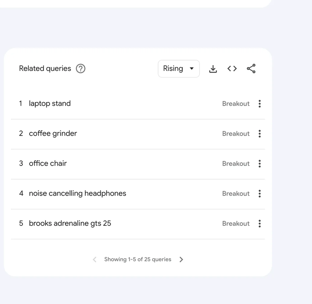
Rising queries show the biggest percentage growth in a term over the previous period, not the biggest volume. A term can appear in Rising with a small absolute audience, as long as it grew fast relative to where it started. When growth passes 5,000%, Trends replaces the percentage with the label "Breakout" instead of a number, since a percentage that large stops being a meaningful figure.
The mistake worth avoiding: treating a Breakout label as proof of a big keyword. It's proof of a fast-growing one, which is a different and sometimes much smaller thing. Check the absolute context, not just the label, before building a content plan around it.
For low-volume queries, a spike can also be statistical noise: Google incorporates small random fluctuations into Trends data to protect privacy, so don't treat every Breakout label as a real trend.
Next to related queries, Trends also shows related topics. These are broader subjects connected to your search. Related topics help you move from one keyword to a bigger content theme, while related queries are better for finding the exact phrases people type.
Active vs. Lasted: Should You Act on This Spike?
Google Trends' Trending Now page marks every trending search with one of two labels: Active or Lasted.
- Active means the term is still being searched more than its usual volume right now — not necessarily still climbing, just still elevated.
- Lasted (shown with how long it lasted, e.g. "Lasted 8 hr") means the term was searched more than usual earlier, but has already settled back down to its typical volume.
Real example, observed October 23, 2026 (Trending Now, United States, "Past 7 days" window): "milwaukee brewers nlcs sweep dodgers" started trending 6 days before the observation, marked Lasted 8 hr — its chart shows a sharp rise followed by a return straight back to baseline within that window. Compare that to a term still marked Active with no duration shown in the same observation, because it hadn't finished playing out yet.
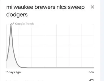
The practical difference: an Active spike is still worth moving on quickly, if it fits your site. A Lasted spike has already peaked, so brand-new content chasing that exact moment is usually behind it — but that doesn't rule out a recap, an explainer, or an evergreen piece on the underlying topic if it's still relevant on its own merits. A Lasted label doesn't mean the topic is dead for good, either: the same term can go Active again later if something brings it back (a sequel event, an anniversary, a follow-up story) — worth a glance at whether there's a predictable recurrence before writing it off completely.
Step 5: Check Seasonality Before You Commit to a Topic
Trends provides enough historical data to see whether a topic is a one-off spike or a genuine yearly pattern. Set the range to "past 5 years" or longer and look for a repeating shape, not just a single peak.
For example, if "running shoes for shin splints" shows the same spring spike every year in Trends, that's a plausible sign people are restarting training after winter, not something unusual happening that particular year. If a topic reliably peaks the same months every year, that's a scheduling insight: publish or refresh the page before the season starts, not after it's already peaking. Publishing early gives the page time to be found, indexed and start showing up before the peak. How early depends on your site and topic.
A topic with no repeating pattern and one isolated spike is a different case, worth treating as a one-time event rather than something to plan an annual content calendar around.
Step 6: Check Geographic Trends
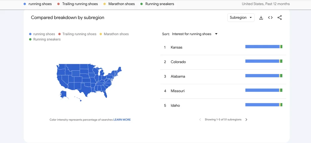
The same search term can carry very different relative interest in different places. Trends breaks interest down by country, and within a country, down to the state/region and, where available, city level.
This matters most if your business or content targets a specific country or region rather than a global audience. A topic with strong overall interest might be carried almost entirely by one country's search activity, worth knowing before you assume it represents your actual market. For a location-specific business, checking the geographic breakdown can also surface which cities or regions are worth a locally-focused page, rather than one general page assumed to serve everyone equally.
Turning Geographic Data Into Local SEO Actions
Seeing that a search term is concentrated in a handful of states or cities is a starting point, not a finished decision. Before building a dedicated page for any location, check for something real to put on it. Does the business actually serve that area? Is there a location-specific detail worth mentioning? Does someone on the team have real local expertise? A page needs a real answer to one of those questions — not just a copy of the main page with a city name swapped in.
Use regional Trends data to flag which services or customer needs might deserve more attention on your website — not to decide where to open a Business Profile. A Business Profile has to accurately represent a real business and its actual service area; don't create an additional profile for a region, or claim to serve a location, just because search interest is high there. Google's own eligibility rules decide where a profile is allowed to exist, and this data doesn't change that.
Regional data from Trends is reported at the state (or larger subregion) level, not the city level — so "concentrated in three states" is a prompt to look closer at which cities within those states the business actually serves, not a justification for three city pages on its own. Example: a service term shows concentrated interest in three states, and the business already operates in specific cities within all three with real local differences to mention (availability, pricing, local regulations) — that's a case worth researching city pages for those specific cities. The state-level search pattern alone, without that real local substance and without checking it maps to cities actually served, isn't.
Trending Now (covered later in this guide) adds a faster version of the same idea: a sudden local spike — a regional event, a weather pattern, a local news story — can be worth a quick, time-limited update if there's a real local angle to add, not just because the term is trending.
Step 7: Find Emerging Topics and Use Trends Alongside Volume Data
Trends is good at answering a question keyword-volume tools generally aren't built for: is interest in this topic growing, flat, or shrinking right now? A keyword tool's monthly search volume number is useful for sizing a keyword, but it may not reflect a topic's recent rise or fall as quickly.
Neither tool replaces the other. A keyword tool tells you roughly how big a topic is. Trends tells you which direction it's currently moving. Used together: start from your seed keywords (see our keyword research guide), then check Trends for any that show a clear upward or downward trend before you commit real effort to targeting them, rather than treating every keyword on a list as equally worth pursuing right now.
Watching the "Rising" list under a broad seed term over time can sometimes show a change in search interest before a monthly volume estimate from a keyword tool reflects it.
Use Trending Now for Very Recent Opportunities
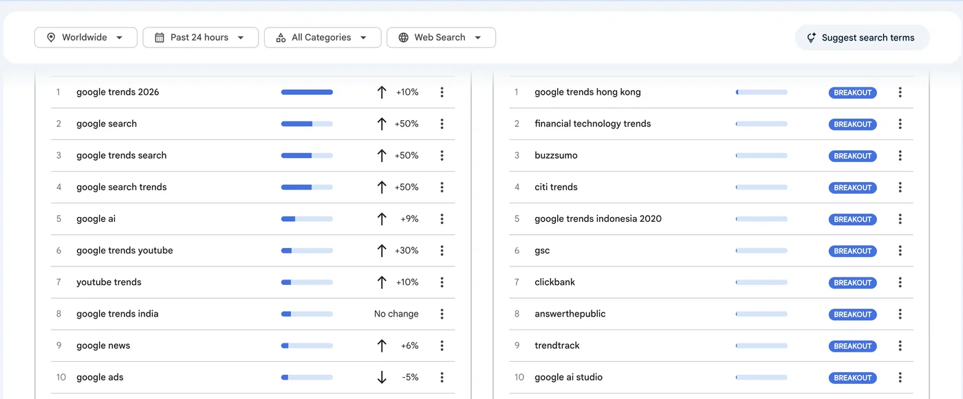
Everything above is the Explore workflow, built for research over weeks, months, or years. Trends also has a separate Trending Now view, for a different question entirely: what's moving right now. It covers 100+ countries and regions, refreshes roughly every 10 minutes on average, and lets you look at the past 4 hours, 24 hours, 48 hours, or 7 days. Its trend chart uses exact-match data, while the Explore page uses broad-match data. It focuses on recent search surges, often around news stories, so it's useful for time-sensitive content rather than the longer-term pattern research covered in the rest of this guide.
Step 8: Turn Trends Data Into Actual Content Ideas
Data without a next step isn't useful. A few concrete ways to act on what the steps above surface:
- A Rising (not just Breakout) query with growth that holds for several weeks, not a single-week spike, is a candidate for a new page or a timely update to an existing one.
- A confirmed seasonal pattern (Step 5) becomes a publishing calendar entry: refresh or promote that page before its season starts.
- A geographic concentration (Step 6) you weren't accounting for is a reason to consider a region-specific page or section, if your business actually serves that region.
- A term that shows consistently strong interest across years, with no strong seasonal pattern, is more likely to behave like an evergreen topic — but that's still a reason to check real search volume and how competitive the SERP actually is (see our keyword research guide), not a reason to commit on Trends interest alone.
For the running shoes example: if "running shoes for shin splints" shows the same spring spike every year in Trends, that's a real, checkable reason to schedule that page's refresh for late winter, not a guess.
Check the Search Type Before Picking a Format
Every Trends chart defaults to "Web Search," but that's one filter among several, not the whole picture. Switch it to Image Search, News Search, Google Shopping (useful for product searches), or YouTube Search and you get relative interest within that specific search type instead. If a topic shows meaningfully higher relative interest in YouTube Search than in Web Search, that's a real signal worth weighing before defaulting to a blog post — a video, or at least a page built around embedded video, may match the way people are actually looking for it.
Tracking Brand Interest Over Time With Google Trends
The Brooks-vs-Hoka comparison in Step 2 works the same way for any two brands you're weighing against each other — the only difference is doing it over a longer window and watching how the lines move, not just which one's on top right now.
Pick two or three real competing brand names and search them together instead of one at a time, same as Step 2. Set the date range to 12 months so you can see the shape of each line, not just a snapshot.
- A line trending up over months means relative search interest increased within that period — it doesn't tell you why on its own. That's worth investigating separately: a product launch, more press, a marketing push, or something seasonal can all produce the same shape. Check before assuming a cause.
- A flat line means relative interest stayed broadly stable in the data you're looking at — not necessarily that nothing changed in the real market.
- A line trending down could be a real decline, or it could just be a seasonal product outside its season. Seasonality is one explanation among several, not the default one.
One thing this chart can't tell you: which brand actually sells more, or converts better. Trends measures search interest, not purchases. Use it as one input toward deciding whether a "Brand vs. Brand" page is worth researching further — not as the sole reason to write it, and not as the deciding factor for which brand name goes first in the title.
Using Google Trends to Find Problem-Awareness Demand
Most keyword research starts after someone already knows what they want to buy or do. Trends can also surface people one step earlier — when they're describing a problem, not yet a solution.
Watch for rising interest in phrases built around a problem rather than a product: "why does X keep happening," "how to fix X," "X not working." A rising line on one of these is a hypothesis worth checking, not proof that a market exists — the next step is to actually look at what's currently ranking for it and whether the problem is one your content (or product) genuinely solves.
If it checks out, a problem-first section or landing page — one that names the problem before pitching a fix — gives you a page for the searcher who hasn't decided on a solution yet, which you can then link to your existing solution-focused content for the searcher who has already decided and is comparing options.
Building a Content Calendar From Google Trends Data
Checking Trends once in a while for ideas is useful. Turning it into a repeatable habit is more useful, and a simple calendar is enough to do it.
Each month (or whatever cadence fits), pull Related topics and Related queries for your core subjects using both the Top and Rising filters. Top shows the related queries searched most frequently in the selected period. Rising highlights queries with the largest increase in search interest compared with the previous period. Use Top to explore established areas of interest and Rising to spot possible new opportunities, then check whether each topic fits your audience and has lasting value.
A simple table covers it: topic, the trend signal that flagged it, the planned publish date, and a refresh date (so older seasonal content gets checked again before its next peak, not just published once and forgotten).
On timing: historical patterns in Trends can help estimate when interest is likely to rise again for a recurring topic — they don't guarantee the exact timing or size of the next peak. Combine that estimate with your own site's publish-to-indexed-and-ranking timeline (something you can check in your own history) and the content's production time to decide when to actually start.
When a trend signal turns into an actual decision, it's usually one of five things: write a new article, update an existing page that already covers the topic, hold it for a seasonal slot next year, make a video instead of an article, or do nothing because a closer look shows it's noise rather than real, sustained interest.
Using Google Trends for YouTube Keyword Research
Google Trends can filter by search type, including YouTube Search specifically — which shows what people search for inside YouTube rather than on the general web.
Real comparison, observed October 23, 2026 (United States, past 12 months): "running shoes" on Web Search shows a sharp seasonal pattern — mostly flat and low through fall and winter, then a steep rise to its 12-month peak in late February/early March, staying elevated through spring before falling back to a low baseline by late summer.
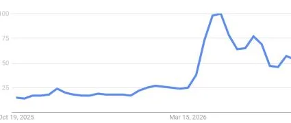
The same term on YouTube Search shows a very different shape: consistently high and comparatively stable across the whole 12 months, with no single sharp peak — mostly moving in the 60-100 range year-round rather than spiking once.
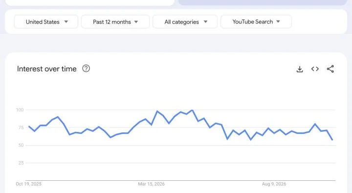
Don't read "YouTube's numbers stayed higher on the chart" as "YouTube has more total searches than the web" — both charts are normalized separately and aren't comparable to each other in absolute terms. What's actually useful here is the pattern within each: the web side has one clear season; the YouTube side doesn't. That's the finding — not which number is bigger.
For this term, the observed Web Search pattern suggests testing a content refresh ahead of the spring rise. The YouTube Search pattern looks less seasonal, so a video may be worth considering throughout the year. These are starting hypotheses, not proven publishing rules. Check your own search and audience data before committing resources.
Once you've picked a direction, switch to Related queries under the YouTube Search filter for the same term — these can suggest real angles people are already searching for, which is a useful starting point for a title, though they're not ready-made titles on their own.
Using Google Trends for Social Media and Reactive Content
Trending Now groups searches by category (Entertainment, Sports, and others), which is a quick way to scan for something worth a timely post, separate from the longer-term content planning covered above.
Breakout-labeled related queries (covered earlier in this guide) are also worth a second look here as possible reactive-social candidates. A Breakout label just means a rapidly growing related query — it says nothing on its own about whether it's actually relevant to your audience. Checking that fit is a separate step every time, not something the label decides for you.
A short same-day workflow: spot the trend in Trending Now or as a Breakout query, check whether it's actually relevant to your audience, and if so, post about it the same day rather than waiting — these move fast, and a post about something that's already Lasted several hours is behind the moment.
Worth being precise about what this does and doesn't do: a timely social post can put your content in front of more people and occasionally earn a mention or a link from someone who sees it. It is not a direct Google ranking signal on its own — the benefit is exposure and reach, not a guaranteed SEO boost.
Using Google Trends for Ecommerce Product Trends
Trends' search-type filter also includes Google Shopping, separate from general Web Search — useful for anyone selling a physical product.
For a specific product term, compare it with the search type set to Shopping against the same term set to Web Search. Shopping and Web Search are two different, separately normalized views of interest — not two numbers you can line up and compare directly. What's worth watching is whether the shape of interest moves differently between the two for that product: does one start climbing noticeably earlier in the season than the other, for example. There's no general rule that Shopping always leads Web for every product; it's something to check per product, not assume going in.
If you do see a pattern like that for a product you actually sell, treat it as a lead worth validating — against your own sales data, product-search console data, or another real demand source — before timing a buying guide or product-page update around it. The Trends pattern is a prompt to go check, not confirmation on its own.
Using Google Trends to Find Questions Worth Answering
A rising search term is also worth checking against what's already showing up for that query — including, where Google shows one, an AI Overview.
The workflow: spot a trend spike, look at what currently ranks and what any AI Overview for that query currently says, and ask a plain question — is there a specific, useful detail missing that you could genuinely add? Not "how do I get featured," but "is the current answer actually complete."
Worth being clear about what this is and isn't: there's no special schema markup or AI-specific technique that improves your odds of appearing in an AI Overview. Google's own guidance is that the same foundational SEO practices — useful, accurate, well-organized content — apply to AI Overviews and AI Mode the same way they apply to regular search results. This section is a research step for finding a genuine content gap, not a visibility tactic.
One more case worth naming: some queries, especially newer or more sensitive topics, won't show an AI Overview at all. That's not a gap to chase — the usual E-E-A-T basics (real expertise, clear sourcing, a credible author) matter for a page's quality regardless of whether an AI Overview happens to appear for that query.
Putting It Together: A Full Google Trends Workflow for One Content Decision
The steps above work individually, but here's how they chain together on one real example, using the running shoes comparison already used earlier in this guide.
Real, continuous example, observed October 23, 2026: "running shoes," United States, past 12 months, using the running shoes comparison already introduced earlier in this guide.
Interest over time (Step 1): mostly flat and low from October through January, then a sharp rise to the 12-month peak in late February/early March, staying elevated with two smaller secondary bumps through spring, before falling back to a low baseline by late summer — a clear, repeatable seasonal shape.
Related Queries, Rising filter (Step 4): checked again live for this example — the list is still mostly unrelated Breakout noise (a solar panel, a coffee grinder, a laptop stand turned up this time), consistent with what this guide's own earlier screenshot already shows. That's a real result, not a gap in the research: it tells you this term's Rising panel isn't where the opportunity is, which is useful to know before spending time on it.
Geographic Trends: Wyoming has the highest relative-interest score at 100, followed by Kansas at 17, with D.C., California and New York at 12. These are relative scores, not search counts. A score of 100 does not mean Wyoming has the most people searching for running shoes. Population, the share of searches devoted to the term, and the limits of sampled data all matter. Treat this result as a clue to investigate, not a reason to build a Wyoming-specific page.
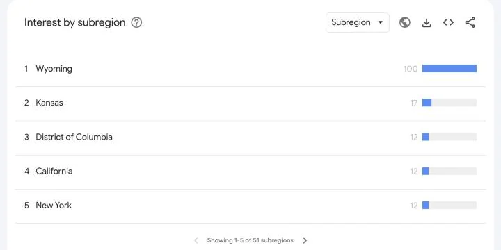
Before treating any of this as a decision: everything above is relative search interest within the selected period and geography. It isn't absolute search volume. It isn't proof of real demand. It isn't proof that ranking is achievable. The Wyoming result above is a direct example of why that distinction matters.
The next step is validation, not action. For this page specifically, that means checking the site's own Search Console data for these terms — which queries are getting impressions, whether clicks follow the same seasonal pattern as the Trends chart, and whether this guide is already getting any of that traffic. That check hasn't been run as part of this proposal; it's the next concrete step before acting on the seasonal pattern, not something already confirmed here.
Resulting lean, pending that check: the clear, repeatable seasonal pattern is the part worth investigating further. The Wyoming spike is not — it isn't validated, and it isn't where this site's audience is concentrated. If the Search Console check confirms the seasonal pattern, the action would be refreshing existing running-shoes content ahead of the late-February rise, timed using this site's own historical publish-to-indexed lead time. That would be "update an existing page" from the five-option decision list above — but only once the validation step above actually happens, not before.
Google Trends and Search Volume
Google Trends doesn't show monthly search volume. Its 0–100 scores show relative search interest for the time and place you picked.
If you need an estimate of how many searches a keyword gets, use a keyword research tool such as Google Keyword Planner, which gives estimated monthly searches. Trends is better for seeing whether interest is rising, falling, seasonal or stronger in one region.
Use both together: a keyword tool for the rough size of a keyword, and Trends for its direction and seasonality. Our keyword research guide covers how to weigh volume against competition.
Is There a Google Trends API?
Yes, but the official API is still in alpha, and access requires applying as a tester. It gives up to five years of data by day, week, month or year, for countries and sub-regions. Unlike the website, the API uses the same scaling across requests, so you can combine data from separate requests. If you just want to check a few keywords, the website is enough.
Google Trends Alternatives
Google Trends is hard to beat for one job: seeing which way interest in a topic is moving. For the questions it can't answer, use a tool built for them:
- Google Ads Keyword Planner: estimated monthly searches for a keyword (shown as ranges unless you run ads).
- Google Search Console: the searches your own site already shows up for, with clicks and impressions over time.
- RankAnalyze: for a keyword you're targeting, a Ranking Audit shows its estimated search volume and keyword difficulty, and Head-to-Head shows the keywords a competitor ranks for that you don't. It doesn't chart interest over time, so use it alongside Trends, not instead of it.
For more free and paid SEO tools by job, see SEO Optimization Tools.
A Quick Google Trends Checklist
Before you act on something you saw in Trends, you should be able to say yes to:
- You know the number is relative interest, not search volume, and haven't compared two separate single-term charts against each other.
- You compared the terms you actually care about together, on one shared chart, rather than judging them from separate searches.
- You used a topic instead of a term when one was available and you cared about the broader concept, not one exact phrasing.
- You checked whether a Rising or Breakout query has real sustained growth, not just a single-week spike.
- You checked several years of history for a seasonal pattern before treating a spike as one-off or as recurring.
- You checked the geographic breakdown if your business or content is region-specific.
- You paired what Trends showed with an actual volume number from a keyword tool before deciding a topic is worth the effort.
Make Trend-Spotting Faster With RankAnalyze
Google Trends is free, but it tells you whether interest in a topic is moving, not whether you can realistically win it. Once Trends identifies a topic worth investigating, Ranking Audit can help assess the page's existing topic coverage and keyword difficulty, while Head-to-Head can help identify competitor keyword gaps.
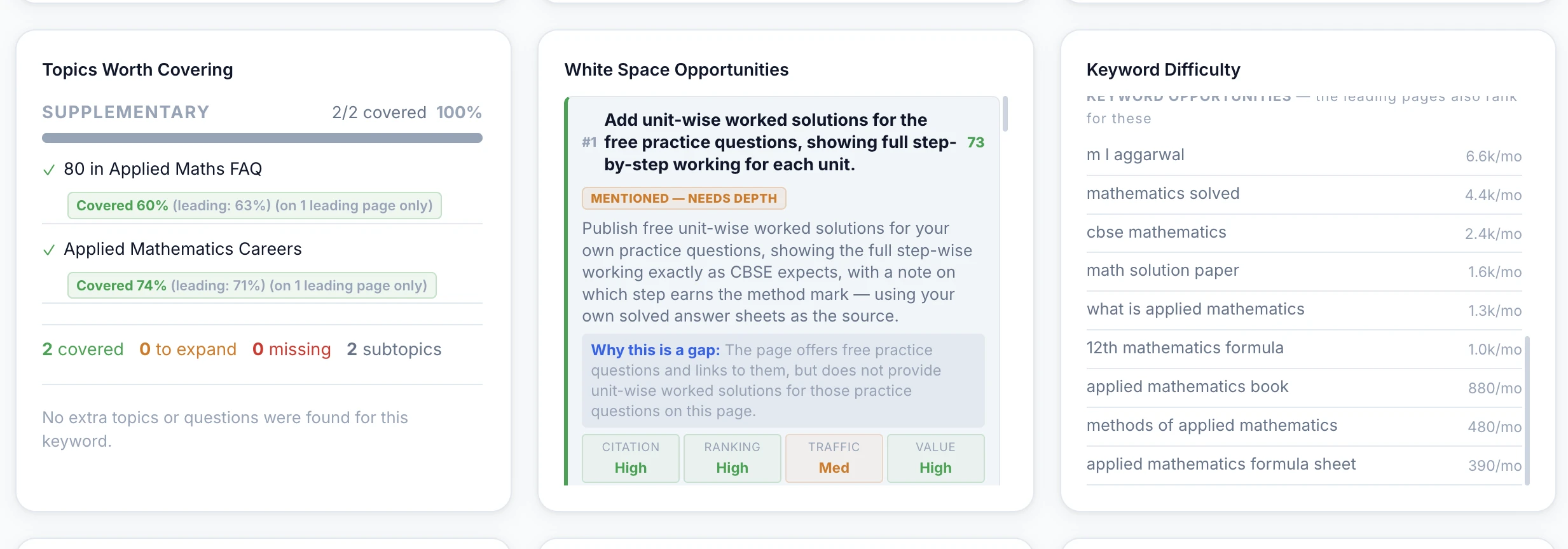
RankAnalyze's Ranking Audit and Head-to-Head turn a Trends signal into a real plan: topic coverage, white space, keyword difficulty, and exactly which keywords a competitor ranks for that you don't.
Frequently Asked Questions
Is Google Trends data the same as search volume?
No. Trends shows relative interest on a 0–100 scale, normalized against the total search activity in the time range and location you selected. It doesn't show an actual number of searches. For an actual volume estimate, you need a keyword research tool, not Trends.
Why does a keyword show as flat 0 on Google Trends?
Trends only shows data for terms popular enough to register in its sample. A flat 0 may mean the term's search volume is too low for the sample to pick up reliably, not that literally nobody searches it.
What's the difference between a search term and a topic in Google Trends?
A search term measures only the exact phrase you typed. A topic groups related searches around the same real-world concept, including different spellings, phrasings, and languages. Google generally suggests using a topic when one is available, unless you specifically care about one exact wording.
What's the difference between a "Rising" and a "Breakout" related query?
Rising shows a percentage growth figure for how much a term's search interest increased over the previous period. Breakout replaces that percentage once growth passes 5,000%, since a number that large stops being meaningful as a percentage. Neither label tells you the term's absolute size, only how fast it grew.
Is Google Trends free to use?
Yes. Google Trends is free to use.
See exactly how ChatGPT, Claude, Gemini, Perplexity and Copilot describe you today.
 RankAnalyze